Commons:Graphic Lab School/Images to improve/Archive/May 2008
Stale
[edit]Languages of Europe
[edit]-
 Blank map of Europe (png)
 -
 Blank map of Europe (svg)
 -
 Another attempt (rendering problems)
 -
 png conversion of the previous one


Articles:
- Europe
- Languages of Europe
- Demographics of Europe
- Alphabetic list of living languages in Europe
- List of language families
Request: --Missmarple 15:53, 15 December 2006 (UTC):
- Request from the en:Wikipedia:Graphic Lab/Maps. -- - lyhana8 [[User
- Ok, I've updated the SVG file with some more coasts and the xmlns tag. The file renders fine on Commons now and seem to work as a 250px thumb as well, so thanks for the tip. I'll be working with Scandinavia now. So if you don't hear from me during a few days, don't think I'm dead, I'm probably just having nightmares about Norway.
- / Mats Halldin (talk) 18:00, 27 December 2006 (UTC)
- Meh. The original is no prize, but tracing into SVG is pointless. ¦ Reisio 02:08, 3 July 2007 (UTC)
- why? Now you can print a poster if you want. Chabacano 21:10, 16 November 2007 (UTC)
- You can, but it will look ridiculous. ¦ Reisio 20:30, 25 November 2007 (UTC)
Transparent compass card
[edit]Request: I made Image:Compass Card.png transparent to use it as an overlay on maps, but doing it to the whole image kills readability depending on the background colour. Is there something that could be done to the image, maybe apply transparency to some areas only, or surround dark colours with white or something? Para 20:15, 18 May 2007 (UTC)
Graphist opinion:
- A good solution may be to use a white disk in background, and to merge your compass on this white background disk. Yug (talk) 23:36, 18 May 2007 (UTC)
- But if I put a white disk in the background, even a transparent one, then the it will be less transparent generally. Anyway, thanks for the idea! I did something else instead: I copied the whole image on another layer, deleted everything but the text and their backgrounds, and made them just a bit transparent. I think they're pretty readable now and can't think of any more that could be done to make it better. It actually looks horrible here on the wiki, but if you try it with Google Earth using the kml at Commons:Geocoding#Parameters, it's much better. Too bad I can't include a screenshot. --Para 16:46, 19 May 2007 (UTC)
M62 motorway
[edit]-
 Entire British Isles (and a bit of Europe)
 -
 The M62 motorway

Article(s): M62 motorway
Request: A separate image with the image "zoomed" onto the path of the M62 (that is, cutting out Ireland, UK north of Preston and south of Birmingham).
Requested by: Suggested by User:Neil here, request made by Sceptre 14:08, 20 August 2007 (UTC)
Graphist opinion: I came up with that. Perhaps I should add the names of the cities? --Ogre 19:03, 20 August 2007 (UTC)
- It looks good, but a bit too big heightwise (I must've made a mistake in my calculations) - labelling the cities would be nice too. Sceptre 19:17, 20 August 2007 (UTC)
- OK, I have reduced the size and added the names of the cities, as far as I could tell from google maps! :-)
- The cities W-E are supposed to be Liverpool, Manchester, Leeds, Hull :) I'll see if I can fix it in a text editor. Sceptre 21:33, 20 August 2007 (UTC)
- I've done a few fixes, but thanks :) Sceptre 21:47, 20 August 2007 (UTC)
- I had 50% wrong! Well, if I go to England one day I will already know :-) --Ogre 07:42, 21 August 2007 (UTC)
- I've done a few fixes, but thanks :) Sceptre 21:47, 20 August 2007 (UTC)
- The cities W-E are supposed to be Liverpool, Manchester, Leeds, Hull :) I'll see if I can fix it in a text editor. Sceptre 21:33, 20 August 2007 (UTC)
Improve my SVG Please!
[edit]
Article(s): hoping to put in the future in w:flag of iran
Requested by: -- Oren neu dag 12:53, 30 September 2007 (UTC)
Graphist opinion:
- Non-graphist opinion: Whatever you do, use a better file name. See, for example, Image:Northern Lighthouse Board Commisioners Flag of the United Kingdom.png (Note the error) and Image:Flag of the Falkland Islands (1948-1999).svg (Note the date range). 68.39.174.238 00:07, 3 October 2007 (UTC)
- A better source image would be nice. ¦ Reisio 02:45, 21 December 2007 (UTC)
- The logo you can get off of Image:Red Lion with Sun.svg. 68.39.174.238 09:17, 11 January 2008 (UTC)
Image:Piłsudski on Poniatowski's Bridge.jpg
[edit]
Article(s):
Request: I would like to request scratch removal and general old image restoration, there are a lot of dust spots, scratches and a few bends.-- Jarekt 13:31, 8 October 2007 (UTC)
Graphist opinion: I'm on this one, it's going good. Will post it here when I'm done. --XcepticZP 21:20, 25 October 2007 (UTC)
Image:Colonia, Uruguay, street scene w.vintage car.jpg - Colors are not correct
[edit]
Article(s):
Request: It seems to me that the colors of this photograph are somewhat unnaturally bluish. Maybe this can be corrected. --ALE! ¿…? 08:45, 5 November 2007 (UTC)
Graphist opinion: Yeah, it seemed bluish to me as well and when I started to adjust the levels -- a little too green as well. Let me know if you think that it needs more correcting. -- carol 14:11, 5 November 2007 (UTC)
- Are you happy with this settings ???--SuperManu SuperMessage 09:32, 1 February 2008 (UTC)
Music map of the United States
[edit]- A long time ago, I created a map (see it at Image:USmusicmap.png), a rudimentary attempt at creating something greater, primarily for en:Music of the United States. I think someone who actually had some experience with image-manipulation, even if not map-making specifically, could make a great map. I could provide all the information necessary to make something very detailed (which I know would be less useful for a Wikipedia article, since you'd have to zoom in to see anything, but would still be interesting to look at, and could even make for a dorm room poster) with symbols showing everything from cities with notable blues scenes to the home of acclaimed symphony orchestras. If possible, maps showing a subset of this information could be used for articles like en:Latin music in the United States. Is anybody willing to do the image work if I do the research work? Tuf-Kat 04:41, 18 November 2007 (UTC)
Terra-skandalen
[edit]
Article(s): nb:Terra-skandalen
Request: Remove the white/blank area in the bottom, might also use one color of green. Røed 23:32, 28 November 2007 (UTC)
Graphist opinion:
- Is there a reason why some of the municipalities are partially transparent (e.g. Hjelmeland and Luster). /Lokal_Profil 01:34, 29 November 2007 (UTC)
- Should do the trick, removed the transparency from several sections, recoloured, removed the black outlining from the central map (makes it a bit more consistent) and removed the dead space from the image. Thoughts? James.mcd.nz 19:50, 17 December 2007 (UTC)
- Looks good but two of the municipalities in the rightmost part of the map are missing gradients. Might be other smaller ones missing it too. /Lokal_Profil 16:47, 21 December 2007 (UTC)
Spanish Wikiquote logo
[edit]


Article(s): Spanish language Wikiquote main page and templates
Request: Wikipedia in Spanish uses a local version of the Wikipedia logo in some templates (a puzzle piece with a Ñ letter on it). It's a expressive logo which combines the meaning of Wikipedia and Spanish language. A similar logo or symbol might be useful for Wikiquote (a wikiquote logo with a capital or lowercase ñ. Or maybe the whole circle might be replaced with a bold ñ. --Javier ME 16:15, 1 December 2007 (UTC)
Of course, I'm not asking you to alter the Wikiquote logo for all languages, just to create a new image for local use. By the way, the Wikipedia symbol might be converted to svg --Javier ME 16:17, 1 December 2007 (UTC)
Graphist opinion:
Thats my two versions, not sure about the wikiquote one, maybe someone else can come up with a better idea for it. James.mcd.nz 13:10, 17 December 2007 (UTC)
Translation German-->English
[edit]

Image:Muskel-molekular.png This image is used on en.wp, but has German text. Could the text be translated and replaced. The image is used on w:Muscle contraction. – Mike.lifeguard | @en.wb 14:43, 6 December 2007 (UTC)
Have converted the whole image into Vector form and translated ~50% of the text to English, but it really needs either a German speaker, or someone who knows alot about the molecular mechanics they refer to in the image to edit the text into something more coherent. Main areas needing work are in Red. Open to ideas.James.mcd.nz 21:34, 16 December 2007 (UTC) Just noticed the problem with the font expanding, will fix it soon.James.mcd.nz 13:14, 17 December 2007 (UTC)
Subspace nodes
[edit]-
(preferably an svg or else a png)
-


Article(s): en:FreeSpace 2
Request: I'd like a free alternative to [1], I feel it is entirely possible to avoid the use of fair-use since lines between stars can't rehttp://commons.wikimedia.org/w/index.php?title=Commons:Graphic_Lab_School/Images_to_improve&action=edit§ion=41 Editing Commons:Graphic Lab School/Images to improve (section) - Wikimedia Commonsally be copyrightable. Mind that three of the 'links' are dotted. There is a good reason for this. ;) -- Cat ちぃ? 22:07, 16 December 2007 (UTC)
Opinion: Are they actually stars, or fictional names?, if they are actually stars, I think you MAY have a point, but if it is a fictional 'galaxy' then I'd say the rights are pretty solidly with the original artist/company who produced the game, it's just another peice of artwork.James.mcd.nz 12:22, 17 December 2007 (UTC)
- These star systems are real. You can search for them on wikipedia for example. -- Cat ちぃ? 14:58, 17 December 2007 (UTC)
Thats my shot. The background is just a plain colour as the patterning on the original isn't really practical for SVG. Otherwise its all there, let me know what you think. James.mcd.nz 18:38, 17 December 2007 (UTC)
- The logo in the bottom right corner should probably go since it's trademearked/copyrighted and the text just above it could be moved to the image description page to make the image language neutral but apart form that it looks good. /Lokal_Profil 01:57, 19 December 2007 (UTC)
Done.James.mcd.nz 13:17, 19 December 2007 (UTC)
District Maps of Turkey
[edit]-
 Adana districts
 -
 Adıyaman districts
 -
 Afyonkarahisar districts
 -
 Ağrı districts


Article(s): Atlas of Turkey
Request: I'd like a general improvement on province map images. I have improved Image:Hakkari districts.png some time ago which can be used as an example. In the 1 December version text was too small, there were whitespace around the image making its use on articles problematic. Şemdinli was incorrectly labeled as 'Semdinli' (mind the Ş/S difference). Similar problems exist on other such maps which are poorly categorized (yet another problem). -- Cat ちぃ? 22:16, 16 December 2007 (UTC)
Graphist opinions:
- Umh... sorry, we can do lot, but not that lot. It will probably need that someone interesting in mapping and Turkey come, and then that will be done. The work seems too lot to be done here, by volunteers, not especially interested by Turkey. Yug Yug (talk) 12:14, 17 December 2007 (UTC)
OTRS Ticket svg
[edit]-
 OTRS Ticket
 -
 OTRS Ticket Recolored


Article(s): N/A
Request: Removal of the Wikimedia Foundation logo. it's presence there may have legal issues as it is making the image unnecessarily unfree. Esthetically it doesn't look too appealing either (no offense to the creator). -- Cat ちぃ? 23:14, 21 December 2007 (UTC)
- Perhaps the ticket image could be in WMF colors instead? Borders could be blue, background green and text red? -- Cat ちぃ? 23:15, 21 December 2007 (UTC)
Opinion:
- Removing the logo makes the image look better. But I'm not sure abot the new colours. I'd say they make the text less legible. /Lokal_Profil 12:19, 22 December 2007 (UTC)
- You hardly can make a legible logo with that versions of green, blue and red. Please consider white as if it was also a WMF colour, so it can be used for letters or background contrasting with the other colours. --Javier ME 11:44, 29 December 2007 (UTC)
- Is there anything wrong with the current colours (i.e. red, orange, black)? I don't think many people will make the connection between Wikimedia colours and Wikimedia so the question then becomes: why fix something which works? /Lokal_Profil 23:10, 29 December 2007 (UTC)
- Also, if you're red/green colour blind, the new version will fuck your shit up. Lewis Collard! (talk, contribs, en.wp)
- It was a nice thought, but I think the old color scheme made the text stand out better anyway...Vladsinger 23:29, 25 January 2008 (UTC)
- You hardly can make a legible logo with that versions of green, blue and red. Please consider white as if it was also a WMF colour, so it can be used for letters or background contrasting with the other colours. --Javier ME 11:44, 29 December 2007 (UTC)
- Using white text in the new version, as stated by Javierme, would be better. Also, users have their monitors calibrated differently, and the dark green background, with the black text will make it especially difficult to see on some monitors, colour blind or not. :). In my opinion white text would be a big improvement. Even on the best calibrated monitor black text on dark background should be a big no-no. GeeAlice 00:00, 29 January 2008 (UTC)
- The Wikimedia logo seems to have been restored by someone. /Lokal_Profil 00:43, 29 January 2008 (UTC)
- Using white text in the new version, as stated by Javierme, would be better. Also, users have their monitors calibrated differently, and the dark green background, with the black text will make it especially difficult to see on some monitors, colour blind or not. :). In my opinion white text would be a big improvement. Even on the best calibrated monitor black text on dark background should be a big no-no. GeeAlice 00:00, 29 January 2008 (UTC)
-

-
 Cleaned up but without lables
 -
 Cleaned with labels
 -
 PNG version. Looks good at full size, but the labels are blurred in the small preview size.


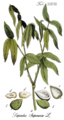
Article(s): fr:Sapindaceae and other wikiprojects
Request: I would like to have the background whitened (but all inscriptions kept). Thanks -- B.navez 19:45, 14 January 2008 (UTC)
Graphist opinion:
- Wouldn't it be better to move the text (not including the lables) to the image description. That would make the file more usefull in different languages. Actually maybe even the lables should go unless we have text (in the image description) that explains what they are, and even then new lables would probably be clearer. /Lokal_Profil 19:53, 14 January 2008 (UTC)
- No, thanks. Original drawing has to be entirely kept, no matter if labels are not really used.--B.navez 20:05, 14 January 2008 (UTC)
- OK, I've uploaded a clean (no lables) version for uses elsewhere. To keep any inscription would require a much more refined tool so I don't think I can do that. /Lokal_Profil 20:20, 14 January 2008 (UTC)
- Fine, however it's better and useful. If someone is able to make a further version also with the labels, it could givee a good reproduction of the original figure. There is no urge.--B.navez 20:28, 14 January 2008 (UTC)
- I worked on this. The labels in my version are all eh, 'good enough' with the exception of the page number(?) in the upper right corner. I considered searching for a similar font right before I stopped working on it. Would a version without that one text chunk suffice? -- carol 15:30, 17 January 2008 (UTC)
- I took a stab and added the labels with the closest font I could find. The text is kinda crisp, but it's labeled. I also made a png version, that was much more clear, but the file was huge to keep the same ratio, so I reduced it by half, but the labels are more blurry than the JPG version when viewed at a smaller size. GeeAlice 02:54, 29 January 2008 (UTC)
- You might try indexing the image at the original size. I think it is safe to reduce these scans of paintings from millions of colors to 256 colors because of the simplicity of the coloring. I am not certain that will change the softness of the fonts when thumbnailed, but it might! -- carol 14:25, 4 February 2008 (UTC)
- I took a stab and added the labels with the closest font I could find. The text is kinda crisp, but it's labeled. I also made a png version, that was much more clear, but the file was huge to keep the same ratio, so I reduced it by half, but the labels are more blurry than the JPG version when viewed at a smaller size. GeeAlice 02:54, 29 January 2008 (UTC)
- I worked on this. The labels in my version are all eh, 'good enough' with the exception of the page number(?) in the upper right corner. I considered searching for a similar font right before I stopped working on it. Would a version without that one text chunk suffice? -- carol 15:30, 17 January 2008 (UTC)
- Fine, however it's better and useful. If someone is able to make a further version also with the labels, it could givee a good reproduction of the original figure. There is no urge.--B.navez 20:28, 14 January 2008 (UTC)
- OK, I've uploaded a clean (no lables) version for uses elsewhere. To keep any inscription would require a much more refined tool so I don't think I can do that. /Lokal_Profil 20:20, 14 January 2008 (UTC)
- No, thanks. Original drawing has to be entirely kept, no matter if labels are not really used.--B.navez 20:05, 14 January 2008 (UTC)
Pasted from my talkpage - Perhaps someone here can help? Thanks! -- Deadstar (msg) 08:46, 25 January 2008 (UTC)
- By the way, do you have an idea why we cannot visualise this file
 at 50px in wiki but
  it is ok at 25px??? is it corrupted or something? thank you again, --SanchoPanzaXXI 21:51, 24 January 2008 (UTC)

- Something is very wrong with this image: I tried to open the svg in Firefox, and it almost "froze up" my computer, until I closed FF after a couple of minutes (!). During this time FF used 700MB+ of memory, dropping to 200MB every couple of seconds (while ~83MB is normal). I have never seen anything like this... P.S.: A screendump of what happened is here. - Erik Baas 23:30, 25 January 2008 (UTC)
- made a new version which works, if you think it's ok i'll replace the old one with it. It's slightly different, so let me know if you want it changed.


- made a new version which works, if you think it's ok i'll replace the old one with it. It's slightly different, so let me know if you want it changed.

hm.. just discovered that the text in the original renders completely different in different sizes.. will look into this /Marmelad 22:26, 27 January 2008 (UTC)
- Well, If the solution is just to create a new file, well, let's do it in that way but I think this is not a real solution...this is not the only svg file I detected with this problem to show image "above" a undetermined number of px; it would be useful to detect what this things happens. Besides that, your version has some errors but no problem, I will amend it, thano you for your support,--SanchoPanzaXXI 09:24, 28 January 2008 (UTC)
- one thing i noticed is that text on path can be problematic when the image is resized. i recommend converting the text to a path before uploading (but perhaps retaining a copy of the original text outside the viewbox for edits) /Marmelad 10:31, 28 January 2008 (UTC)
- it seems the problem is with paths linking other paths (rsvg gives floating point errors, but there may be other problems). /Marmelad 11:43, 28 January 2008 (UTC)
Pixelized SVG
[edit]This SVG looks pixelized or distorted in its full size after uploaded to MediaWiki. I have never encountered such problem before for writing other similar SVG such as this one Image:Tseung Kwan O Line.svg. Please help resolve my mystery, thx.
Article(s): graphic description page itself; zh:東鐵綫
Request: -- Sameboat - 同舟 00:58, 28 January 2008 (UTC)
Graphist opinion: the later image is very wide, and gets shrunk when rendered as a png by mediawiki. this can degrade the quality of e.g. text elements. /Marmelad 08:49, 28 January 2008 (UTC)
- I have decreased the scale between stations so it's now 1100px wide (originally 1400px), but still looks distorted. Perhaps the optimal width is below 800px I guess... -- Sameboat - 同舟 12:02, 28 January 2008 (UTC)
- Correct, after numerous test, the best width is 1023px or below. Is it the same to other users? -- Sameboat - 同舟 12:16, 28 January 2008 (UTC)

I'm also having SVG display issues
[edit]
Request: I'm trying to create and SVG file, but can't get it to render properly. The above image is a PNG of what it is supposed to look like. The SVG file is located at Image:North Dakota's Legislative District 30.svg. I created the SVG using Inkscape. I originally created the image from a shapefile using a GIS editor, exported to PNG, and did the editing and coloring in AdobePhotoshop Elements 4.0. I then imported the PNG into Inkscape and converted it to a plain svg file. Based on Help:SVG, I presume the problem has to do with link reference files within Inkscape, but I can't seem to figure out how to remove those from the file before saving it. The xml editor within Inkscape crashes on me when I try to launch it, and editing the file later in a text editor doesn't seem to work. I'm on OS X Leopard, and this is my first attempt at creating SVG files. Any help is greatly appreciated, otherwise I may have to resort to uploading these as PNG files and relying on others to do the conversions for me.Dcmacnut 04:13, 30 January 2008 (UTC)
Graphist opinion: Im trying to help but Im not an expert myself. Look at your file, it says itself /Users/<obfuscated username here>/Documents/wikipedia/nd030.png missing! so your convertion didn't work (at all, because your file is 1KB size) and you need to redo it properly without embedding any raster file. Good luck! Morgoth666 09:39, 30 January 2008 (UTC)
- I think it works on my computer...firefox on Windows 2000...--SuperManu SuperMessage 09:12, 1 February 2008 (UTC)
Can anyone fix this map?
[edit]This map Image:Map 1914 WWI Alliances.jpg is completely wrong in the South Balcans area: the borders are not those existing at the onset of World War I. Have a look at Greece, Bulgaria, Albania, Serbia, Turkey. They are one Balcan war back... --User:G.dallorto 13:15, 4 February 2008 (UTC)
correction of vertical perspective distortion
[edit]Hi! I would like to ask a review. What is your opinion about this question? (If there is a better page for my request, please move it to there.) I have uploaded some photo for illustration. I would like to know which is the best. I am a new member here and I am happy to get any other idea from you.
-
 original photo
 -
 partially corrected
 -
 corrected
 -
 corrected and cropped


Thanks in advance! Samat 23:23, 8 February 2008 (UTC)
- I really like the fourth image and wrote about it here -- where a non-expert attempts to explain what emotions do to distort a first view of buildings like this. -- carol 18:20, 9 February 2008 (UTC)
- Hi! I also prefer the 4th one "corrected&cropped." Without cropping the parts of the other buildings are unnecessary. Distortion correction also makes it look better, imho. --Ramirez 11:22, 11 February 2008 (UTC)
European road network with ~1990 borders
[edit]
Article(s): w:International_E-road_network
Request: The roads in this map are (probably) OK, but the country boundaries are out-of-date. Since Germany is reunificated and Soviet Union still exists, it shows a map for 1990/91. Could anyone fix the borders? The main differences are in Soviet Union, Yugoslavia and Czechoslovakia. -- Amorim Parga 17:39, 28 February 2008 (UTC)
Graphist opinion:
- I honestly don't think it's worth it - we can probably find more accurate, more accessible data for an SVG somewhere. ¦ Reisio 08:54, 12 March 2008 (UTC)

Article(s):
Request: My request is to improve the part of the yoke and arrows in the CoA according to how it appears on Image:Escudo Real.png, and to see if there is any overall changes that need to be done also (the form of the shield, the collar, and the burgundy cross) -- Oren neu dag 22:08, 11 March 2008 (UTC)
Graphist opinion:
Eggs plate
[edit]
Request: I scanned and uploaded this illustration of eggs from an old Larousse encyclopaedia (similar to "Reptiles" above). I have not processed the image except to reduce the file size. The left and right edges are blurred and the background is not totally white. Can anyone say what should be done to improve it or to make it more useable? Strobilomyces 19:02, 25 March 2008 (UTC)
Graphist opinion: To fix the blurred edges, Maybe you can rescan the edges (placing them in the middle) and combine the clean version with the picture? Jeekc 03:49, 2 April 2008 (UTC)
Old magazine illustrations
[edit]-
 Returning from Kern River
 -
 Raw scan of same, to show what I'm working from


Article(s):
Request:
This time I'm mostly looking for advice. I have some old (1860s) Harper's magazines. There are a lot of interesting illustrations. See A Peep at Washoe for some examples. I've been doing these as follows:
- scan at 300 dpi
- convert to grayscale
- use GIMP to threshold it to straight B&W
- use GIMP to clean up some stray pixels from imperfections in my copier or in the nearly 150-year-old paper
I assume that the third step is the most controversial; I need to do something, though, to deal with image bleed through the page.
Do people think I've come up with an acceptable approach? Does someone have a better idea? - Jmabel | talk 04:08, 29 March 2008 (UTC)
Graphist opinion:
Have you tried scanning the image with a black piece of paper on the other side. This should reduce "bleed thorugh" of text. /Lokal_Profil 00:16, 30 March 2008 (UTC)
- No, but that's the least of the problems: it's pretty easy to get rid of the bleed.
- What I've tried doing since I last wrote (with a good bit of success) is to posterize with a few more levels, rather than go to pure B&W. I'm pretty happy with what I'm getting out of this now. - Jmabel | talk 23:30, 30 March 2008 (UTC)
Did you try following the procedure here?. --Jak 13:36, 31 March 2008 (UTC)
Resolved
[edit] Done Egyptian painting
[edit]-

-
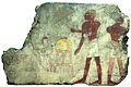 Proposition --SuperManu SuperMessage


Could it be possible to detour this image ?
Article(s):
Requested by: -- Rama 09:51, 13 August 2007 (UTC)
Graphist opinion: Is it find ???--SuperManu SuperMessage 10:44, 20 September 2007 (UTC)
Done Nazi-Soviet Pact
[edit]-
 Original version
 -
 SVG version


Article(s): Molotov-Ribbentrop Pact
Request: I think that a better diagram could be created for this image. It seem very "grainy" and difficult to read. I would assume that a better map could be made, perhaps without so many abbreviations. If you have any questions, please contact me at my talk page. Ian Manka 08:13, 31 January 2007 (UTC)
Graphist opinion: I volunteer to create an SVG version of this diagram. With me a good luck :-) --Miko3k 03:07, 26 February 2007 (UTC)
- I just uploaded SVG version. If someone finds any problems with image, please let me know.
- This SVG map is excellent, Miko. Good job. Greetings from Argentina.--Rafunken 17:17, 9 May 2008 (UTC)
Done Panasonic Walkman
[edit]
Article(s): w:Portable audio player, w:Personal stereo.
Request: It would be nice to have the background whitened. I am unsure how to. Lcarsdata 10:56, 5 May 2007 (UTC)
Graphist opinion:
- I tried myself, is this any good? Lcarsdata 20:56, 6 May 2007 (UTC)
- Nice job, it's effectively better. --Yug (talk) 21:03, 6 May 2007 (UTC)
- I took a crack at it, what do you think? Foobaz·o< 09:06, 21 May 2007 (UTC)
- Nice job, it's effectively better. --Yug (talk) 21:03, 6 May 2007 (UTC)
- Thanks, yours looks far better than my terrible effort. Lcarsdata 15:01, 21 May 2007 (UTC)
Done Pattern in svg-file
[edit]
I uploaded an svg-map which contains three patterned areas. However when rendered by wikipedia/wikimedia (as png?) those areas don't appear as pattern but uniform colour (mix of the two colours of the pattern I believe). Is there a way to display them correctly, i.e., as pattern? Bamse 05:53, 4 June 2007 (UTC)
- It's been solved. When cloning rectangles to create a pattern in inkscape I specified an "initial color" which was different from the rectangle's color. That's what caused the trouble. Strangely enough it looked ok in inkscape. Bamse 07:04, 5 June 2007 (UTC)
- Inkscape doesn't allow clones to have different colours from their parents. rsvg (and firefox) do however. /Lokal_Profil 10:27, 1 February 2008 (UTC)
Done Black blobs in SVG
[edit]
Request: I'd appreciate if somebody could solve the bug in this image. There's a black blob instead of nicely distributed names, as in [2]. I have frequently this bug when editing svg in Inkscape :(. Thanks in advance. PatríciaR msg 13:42, 1 July 2007 (UTC)
Graphist opinion:
Save as 'simple SVG', not 'Inkscape SVG' and use http://validator.w3.org/. The principle code issues are at the end of the markup.
Here is an empty, valid template:
<?xml version="1.0" standalone="no"?>
<!DOCTYPE svg PUBLIC "-//W3C//DTD SVG 1.1//EN" "http://www.w3.org/Graphics/SVG/1.1/DTD/svg11.dtd">
<svg
	version="1.1"
	xmlns="http://www.w3.org/2000/svg"
	xmlns:xlink="http://www.w3.org/1999/xlink">
	<desc></desc>
</svg>
In general, you're going to want to clean up any SVG from Inkscape either manually/by hand (in a text editor), or at least using some 3rd party cleaning script.
Personally, however, I wouldn't bother to try and improve this image, since the paths seem to be generated from a poor trace (there aren't really any good traces). It would not be difficult to recreate this image with just circles and lines from the center, and of course the text, which is trivial.
¦ Reisio 04:22, 3 July 2007 (UTC)
- Thanks for the advice! Yes it's really poor tracing, I've tried to figure out whether Inkscape can do it better or not, but I'll lose less time if I just do it from scratch. PatríciaR msg 10:24, 3 July 2007 (UTC)
- I've also struggled black blob syndrome. Fortunately w:en:User:Kjoonlee taught me the way to solve this problem. I copy that way [3] here with little modification.
- Download svg file & open it by Inkscape
- Press "F1" key for Selection tool
- Click on text object (select it)
- Press "F8" key for text tool.
- See blue box. The blue box is for flowed text. Inkscape's flowed text is not supported in SVG 1.1 viewers or at Wikipedia/Commons.
- Press F1 key again.
- Shift-click on other text-object to select both.
- Go into ”テキスト"(text) menu. Click on "テキストに変換"(convert into text, or Change to text or so in English)
- Save
- Thanks.--Was a bee 17:30, 14 July 2007 (UTC)
- I've also struggled black blob syndrome. Fortunately w:en:User:Kjoonlee taught me the way to solve this problem. I copy that way [3] here with little modification.
DoneFlag of Ireland- Pantone colors to RGB, CMYK and Hex
[edit]
Article(s):w:Flag of Ireland
Request: Trounce 15:39, 3 July 2007 (UTC) The precise colors of the Irish flag are defined as Pantone 347 and Pantone 151 (and white). Does any body have an objective, accurate and "standardized" way to extrapolate the RGB, Hex and CMYK values from the given Pantone colors? Or maybe wiki commons has a policy on extrapolating colors from Pantone colors? (if not maybe we should!) There is a discussion on the Talk page of the article here.
UPDATE: I found a discussion on the very topic here (which was cut & pasted from here)--Trounce 10:56, 11 July 2007 (UTC)
Graphist opinion:
http://www.pantone.com/pages/pantone/colorfinder.aspx ¦ Reisio 05:20, 19 December 2007 (UTC)
Done Christian history
[edit]
Articels: Probably Christianity, some others. Schism maybe?
Request: An SVG that can be translated. if nothing else an image that doesn't contain automatic spell-checking underlining. 68.39.174.238 00:20, 9 August 2007 (UTC)
Oppinion: That should be pretty fast to do. When I come back from work I can do it. --Ogre 06:42, 9 August 2007 (UTC)
- Save yourself ten minutes: it's already been done. :) Lewis Collard! (talk, contribs, en.wp) 15:57, 9 August 2007 (UTC)
- Oh well, next time! :-) --Ogre 17:46, 9 August 2007 (UTC)
- Most wikis superseded this image with a ibrid image/text version, with just the three and the text superimposed. You can find my version here and simply translate it. --Jollyroger 12:45, 26 September 2007 (UTC)
- Huh. How did spell check underlines get on an image? 71.176.112.29 03:09, 21 January 2008 (UTC)
Done Old "Brazillian" flag > SVGification
[edit]-
 Could use this for the sphere/design.
 -
 This is the background thing...
 -
 SVG file


Articels: w:Argentine-Brazil War/w:Uruguayan War
Request: SVGification 68.39.174.238 20:17, 19 September 2007 (UTC)
Oppinion:
- Just watch in the lower right part of the description page of the png file and you will find the SVG file, made...in january 2007. historicair 12:37, 20 September 2007 (UTC)
- I'm on 640/480, so I don't see that; Thanx 68.39.174.238 18:09, 21 September 2007 (UTC)
Done SVGify
[edit]-
 Original
 -


Articels: w:Chi Rho and others.
Request: An SVG version of this, or the same idea. 68.39.174.238 19:44, 22 September 2007 (UTC)
Oppinion:
Done SVGify
[edit]

Articels: w:Double-Tenth Day
Request: SVGify. 68.39.174.238 23:37, 5 October 2007 (UTC)
Oppinion: Please, check if it does exist before asking, in this case, a vectorial version was alrready in commons...the name was used...thanks--SuperManu SuperMessage 10:07, 8 October 2007 (UTC)
Done Image:Old Jew in Warsaw Ghetto.jpg
[edit]
Article(s):
Request: I would like to request scratch removal and general old image restoration.-- Jarekt 13:27, 9 October 2007 (UTC)
Graphist opinion:
Done Image:Newworldmap.svg
[edit]
Lesotho, Maldives, and other small islands are missing. Sahmeditor 17:12, 14 October 2007 (UTC)
- To be honest, there's no real point using this image. There are much better ones around with more detail (which I assume would include the islands you're talking about) like Image:BlankMap-World6.svg. Time3000 16:45, 16 October 2007 (UTC)
Done Scanning trouble
[edit]-
 Orginal
 -
Modified

Articels: Newfoundland and others
Request: Can the strange rainbowing on the crate behind the dog in the lower right hand corner be corrected? 68.39.174.238 19:09, 19 October 2007 (UTC)
Oppinion: Black background was also removed. Wordhunter 13:58, 23 October 2007 (UTC)
Done Flag of East Timor.png and Flag of East Timor.svg
[edit]-
 Corrected PNG-image
 -
 Still wrong: The SVG-image


Article(s):A lot of East Timorese article
Request: I corrected the position of the white star at the PNG-image (compare to Flags of the world. The star has to point to the upper left corner), but I do not have the possibility to convert it to SVG, which is much more in use than the PNG. -- Patrick 06:03, 23 October 2007 (UTC)
Graphist opinion: I did it...--SuperManu SuperMessage 08:37, 23 October 2007 (UTC)
Done CoA of Huittinen
[edit]

Article(s): fi:Huittinen, a village of Finland
Request: SVG is fuzzy and it is also broken. Can someone make working SVG, should't be hard one. -- 213.186.239.49 07:01, 25 October 2007 (UTC)
Graphist opinion:
I'll do it, will post it back here on Monday. user:james.mcd.nz 14-12-07
Something strange going on with the colours when I export the image, I'll try to figure it out, but in the mean time this is where I have got to. It's actually a bit of a nasty file to work off, low res. and also there is some complicated shading which doesn't translate to vector form so well. Let me know of any other suggestions, I'll keep working on the colour.James.mcd.nz 17:18, 16 December 2007 (UTC)
- Hi. There is also higher resolution version: [4]. Perhaps this is littlebit usefull for you :) --213.186.241.29 21:08, 25 December 2007 (UTC)
- Actually, you dont need to vectorize that Coat of arms. I used this bitmap to vector tool: Vector Magic. It made awesome coat on that, but it need little shave and it is complete. Thansk anyway. --213.186.241.29 22:16, 25 December 2007 (UTC)
Done Grants without pants
[edit]
Request: Can someone or anyone clean and straighten this image? I can't even look at it. -- carol 10:55, 26 October 2007 (UTC)
Graphist opinion:
It'd have to be distorted... :/ ¦ Reisio 04:25, 28 October 2007 (UTC)
- Brightened, straightened & sharpened. > Rugby471 talk ⚔ 07:00, 28 October 2007 (UTC)
Request author thank you: A quick glance tells me that a nice job was done of this, thank you. I think I am going to Categorize this image somewhere that the people who are really into that kind of thing will handle it. It will be nice if they determine a category for this image as quickly as it was repaired here. -- carol 12:57, 28 October 2007 (UTC)
Done Font help
[edit]Article(s): en:Governorates of Tunisia, en:Tunisia Request: I tried to change the font in Inkscape, which worked, but when I uploaded it to commons, it didn't change, can anyone make a better font for the numbers? Thanks! Escondites 17:06, 27 October 2007 (UTC)
Graphist opinion: You could convert the text to paths. Path > Object to Path (SHIFT+CTRL+C) ¦ Reisio 04:23, 28 October 2007 (UTC)
- Or embed the fonts directly in the SVG. All you have to do is in Inkscape, go to Edit > XML Editor and individually select the text objects in the left pane , then in the right pane go to each one's style attribute and add to it ;font-family:Bitstream Vera Sans (with the semiclon at the front, it is to separate arguments in an attribute) or exchange Bitstream Vera Sans for whichever font you want. Then click Set. Do this for every text object and if Media Wiki supports your font, it should work. > Rugby471 talk ⚔ 06:48, 28 October 2007 (UTC)
Done SVGification of a simple seal
[edit]-

-
SVGified version (traced)
-
 Final?

Articels: w:United States Department of the Interior
Request: SVGify, to go along with the already SVGified buffalo/bison seal the DoI uses. 68.39.174.238 04:24, 4 November 2007 (UTC)
Oppinion: is it ok? --Ramac 13:55, 6 November 2007 (UTC)
- Could you sharpen the lines? It looks kindof blurry... 68.39.174.238 19:26, 10 November 2007 (UTC)
- Image part is ok but the text looks wrong. Is it possible to create it as real text (using the correct font) and then bend that instead? /Lokal_Profil 01:50, 29 November 2007 (UTC)
- Also (looking at it closer) the mountains should be sharper (i.e. pointier). /Lokal_Profil 01:53, 29 November 2007 (UTC)
- I created a version without the text. if someone could tell me the font used (or one which is close enough) then I'll give that part a try. /Lokal_Profil 02:29, 29 November 2007 (UTC)
- Font is Arial, or at least painfully close to it (tail leg on the 'R's are sightly different).James.mcd.nz 19:09, 17 December 2007 (UTC)
- I've added you're text to my first stab at the logo (used this since cleaner code). Just then I realised that the dots in "U.S." were missing. Do you mind generating the text again and updating? /Lokal_Profil 01:52, 19 December 2007 (UTC)
- Done, sorry should have caught that one.James.mcd.nz 13:11, 19 December 2007 (UTC)
- Thanks. I've now done the latest update using your punctuated text. The image isn't perfect but unless anyone dissagrees I'd say the two other svg files can be deleted (James.mcd.nz has been added as author of Image:US-Department of the Interior, old logo.svg) /Lokal_Profil#
- Done, sorry should have caught that one.James.mcd.nz 13:11, 19 December 2007 (UTC)
- I've added you're text to my first stab at the logo (used this since cleaner code). Just then I realised that the dots in "U.S." were missing. Do you mind generating the text again and updating? /Lokal_Profil 01:52, 19 December 2007 (UTC)
- Could you sharpen the lines? It looks kindof blurry... 68.39.174.238 19:26, 10 November 2007 (UTC)
Excellent work, thank you. 68.39.174.238 23:07, 31 December 2007 (UTC)
Done An SVG
[edit]

Articels: Head of state standards and the PD-AR-Pres. template.
Request: Use Image:COA of Argentina.svg to come up with an SVG of this standard. 68.39.174.238 19:29, 10 November 2007 (UTC)
Oppinion:
- Is this ok? /Lokal_Profil 21:26, 5 January 2008 (UTC)
- Should be, 68.39.174.238 09:19, 11 January 2008 (UTC)
Done Unknown problem with Gell-Mann picture
[edit]
Article(s):
Request: Those pictures don't show correctly. -- QWerk 10:23, 11 November 2007 (UTC)
Graphist opinion:
They seem to show fine for me. One is obviously redundant to the other, however. ¦ Reisio 16:01, 11 November 2007 (UTC)
- Hmmm.. Strange, while ago those pictures didn't work at all on articles. But now it works. --QWerk 17:45, 11 November 2007 (UTC)
- A similar problem has been reported to the French village pump. Please, note that down-scalled images are usually not welcome and are candidates for deletion. See this page for an explanation. QWerk, it would be kind of you to ask for its speedy deletion. — Xavier, 18:03, 11 November 2007 (UTC)
- Yeah. I thought that the problem was on larger pictures size (2 MB). But it wasn't. --QWerk 18:03, 12 November 2007 (UTC)
- A similar problem has been reported to the French village pump. Please, note that down-scalled images are usually not welcome and are candidates for deletion. See this page for an explanation. QWerk, it would be kind of you to ask for its speedy deletion. — Xavier, 18:03, 11 November 2007 (UTC)
Done Merging images into an icon for b:First Aid
[edit]


Article(s): It will be used as an icon for b:First Aid once it (hopefully) becomes a Featured Book.
Request: I'd like the Globe as the back ground with the star of life over top, and offset (ie opposite of the combo shown). As well, if anyone feels up to re-doing the star of life icon with shiny Nuvola-like flair, feel free to do so, and use that instead (and remake the combo at the right). I'm definitely up for learning how to do this sort of thing myself, so if you get this done, can you let me know what software you used so I can try to mimic your work? Thanks a bunch! – Mike.lifeguard | @en.wb 09:16, 22 November 2007 (UTC)
Graphist opinion:


- I created the image at the right, I'm not sure if it's what you were looking for. To "Nuvola-flair" the star of life icon I merely added a gradient shape to the top and a shadow behind - it isn't perfect but hopefully it's close enough ;) If someone else comes up with something better feel free to upload over top of my version.
To Mike.lifeguard - I use the free program Inkscape to do my vector work, though you can use programs like Adobe Illustrator and such to export vector graphics. Feel free to drop me a note on my talk page if you want any more info :) -- Editor at Large • talk 23:25, 22 November 2007 (UTC)
- I thought the idea was that of Image:Globe-Star of life.svg? Haven't put a glare in mine though/Lokal_Profil 23:30, 22 November 2007 (UTC)
- *cough*, you're right of course... I fixed my version. I guess I didn't read the description properly :P -- Editor at Large • talk 23:45, 22 November 2007 (UTC)
- At the same time as I updated my image to use you're flair =). I'll mark mine as a dupe. /Lokal_Profil 23:47, 22 November 2007 (UTC)
- Heh, great minds think alike I suppose! Well it was a great team effort, hopefully Mike.Lifegard likes it -- Editor at Large • talk 23:50, 22 November 2007 (UTC)
- At the same time as I updated my image to use you're flair =). I'll mark mine as a dupe. /Lokal_Profil 23:47, 22 November 2007 (UTC)
- *cough*, you're right of course... I fixed my version. I guess I didn't read the description properly :P -- Editor at Large • talk 23:45, 22 November 2007 (UTC)
- Actually, I liked the version with the star of life big and the globe over top, so I switched Lokal Profil's version to that... or something. Forgive me for uploading over top, but it would have been deleted anyway. – Mike.lifeguard | @en.wb 18:38, 23 November 2007 (UTC)
Done Arrowheads in SVG renders wrong on wiki.
[edit]
The arrowheads looks wrong, when I upload it to commons. In Inkscape it looks fine. Can anybody tell me what I'm doing wrong here. Kjaergaard 13:29, 31 December 2007 (UTC)
- arrowheads are a known problem and don't render correctly in the mediawiki software. use the stroke to path command in inkscape to make a version for wikipedia upload. /Marmelad 17:02, 4 January 2008 (UTC)
Done Reverse US Flag.svg
[edit]
Article(s): it's part of the Category:United States related Fictional Flags
Request: Plz help me by straightening up the stars -- Oren neu dag 19:16, 2 January 2008 (UTC)
- Sure...
- i want the stars to be arranged in more of an orderly fashion than the way they are now, and i haven't been able to do so alone so far, so this is why i'm calling for assistance. Oren neu dag 11:31, 4 January 2008 (UTC)
Graphist opinion:
- Could you explain in more detail what you want done? /Lokal_Profil 20:19, 3 January 2008 (UTC)
- done and uploaded on top of old one. /Marmelad 16:58, 4 January 2008 (UTC)
Done Twin lychees
[edit]-

-
 for resembling (1800^2)
 -
 fruits for the desktop
.JPG)
-source-square.jpg)
-source.jpg)
Article(s): for wikipedia articles on Sapindaceae
Request: I would like to have the fruits detoured, turned straight down on a black background like on this picture  for lychees and maple belong to same family and this is one of the resemblances I would like to show-- B.navez 18:27, 6 January 2008 (UTC)
Graphist opinion: :Looks like an interesting challenge -- do you have the original original? I don't even need the raw image, just the jpeg that came off the camera will do. -- carol 19:09, 6 January 2008 (UTC)
Here it is : -source.JPG) . Thanks. --B.navez 19:40, 6 January 2008 (UTC)
. Thanks. --B.navez 19:40, 6 January 2008 (UTC)
- Yeah, thanks for the original. It is surprising what a really big deal image work is for some software. -- carol 01:22, 7 January 2008 (UTC)
- Thank you very much. It was time : I ate them !--B.navez 18:27, 7 January 2008 (UTC)
Done Vampire barnstar
[edit]
Article(s): None - it's a personal user award which I'm going to award some well deserving editors.
Request: I tried many times to get the background transparent like most other barnstars, but to no avail. It'd be great if this could happen Cheers, Spawn Man 10:22, 7 January 2008 (UTC)
Graphist opinion: I don't even want to go on record asking this question, but it begs to be asked: Do you want the cracks to be transparent as well? -- carol 00:12, 8 January 2008 (UTC)
- Nah. Thanks for asking - don't worry, I didn't think it was a silly question. Quite the opposite in fact. :) Cheers, Spawn Man 00:39, 8 January 2008 (UTC)
- There you go. It could have had more improvement -- I am not certain about the editors who it is intended to award though. -- carol 02:39, 8 January 2008 (UTC)
- I thought you said the cracks weren't going to be transparent...? I'm sure I said it somewhere - silly me, must've left it out. Yeah, sorry 'bout that; would it be too much to ask if the cracks could be left transparent? So basically just the outline of the star and the centre hole... And yes, the people getting it are very deserving lol! Sorry to be a bother... Cheers, Spawn Man 02:42, 8 January 2008 (UTC)
- Easy to do with this barnstar, not so easy to do with the docu-drama/fiction occuring elsewhere at the same while. -- carol 04:09, 8 January 2008 (UTC)
- Wow, awesome! Thanks for the help - maybe the middle version could be deleted or do we just leave stuff like that on commons? Cheers and thanks a bunch! :) Spawn Man 04:41, 8 January 2008 (UTC)
- I thought you said the cracks weren't going to be transparent...? I'm sure I said it somewhere - silly me, must've left it out. Yeah, sorry 'bout that; would it be too much to ask if the cracks could be left transparent? So basically just the outline of the star and the centre hole... And yes, the people getting it are very deserving lol! Sorry to be a bother... Cheers, Spawn Man 02:42, 8 January 2008 (UTC)
- Heh, trust me. It is easier to leave it than it is to delete it. Do you know if there is a category for barnstars here? -- carol 04:52, 8 January 2008 (UTC)
- There you go. It could have had more improvement -- I am not certain about the editors who it is intended to award though. -- carol 02:39, 8 January 2008 (UTC)
Done Fixing CoA of South Vietnam.svg
[edit]-

-
Final stab at the dragon
.svg)
Article(s): South Vietnam
Request: plz help to fix the three vertical stripes Oren neu dag 07:07, 14 January 2008 (UTC)
- Yes. that was my problem and this is what needs fix. Oren neu dag 12:39, 14 January 2008 (UTC)
- P.S. it's also worthwhile to see if the colour of the dragon can be a homogeneous dark blue like in the original gif file. Oren neu dag 12:59, 14 January 2008 (UTC)
- Based on the FOTW site i can safely say that the dragon should be homogenously all dark blue colored. Oren neu dag 06:10, 15 January 2008 (UTC)
- As far as i can say the first stab at the dragon looks great, but here's a layman's question: why couldn't the alterations to the dragon be done inside the already existing CoA of South Vietnam.svg? Oren neu dag 13:25, 16 January 2008 (UTC)
- I'd like the final version very much be uploaded on top of the existing CoA of South Vietnam.svg, and i'll appreciate that. Oren neu dag 16:21, 16 January 2008 (UTC)
- Upload on top of it. Oren neu dag 07:28, 17 January 2008 (UTC)
- I'd like the final version very much be uploaded on top of the existing CoA of South Vietnam.svg, and i'll appreciate that. Oren neu dag 16:21, 16 January 2008 (UTC)
- As far as i can say the first stab at the dragon looks great, but here's a layman's question: why couldn't the alterations to the dragon be done inside the already existing CoA of South Vietnam.svg? Oren neu dag 13:25, 16 January 2008 (UTC)
- Based on the FOTW site i can safely say that the dragon should be homogenously all dark blue colored. Oren neu dag 06:10, 15 January 2008 (UTC)
Graphist opinion: by fix, do you just mean the middle one should be extended all the way down? /Marmelad 09:17, 14 January 2008 (UTC)
- Extended the rectangle. Don't want to attack the dragon unless I know how it's supposed to look like. Is Image:South Vietnam coat of arms.gif a reliable source for what the dragon looked like? /Lokal_Profil 19:42, 14 January 2008 (UTC)
- being a CoA, perhaps it should be one colour only, with any strokes in the background colour? /Marmelad 23:03, 14 January 2008 (UTC)
- My first stab at the dragon. I'll need to work on the face but I'd like a general opinion about the new look. Also I made the stripes of equal width and centered them over the shield. /Lokal_Profil 22:17, 15 January 2008 (UTC)
- They Could. I just didn't want to mess that one u in case you guys didn't like it =). Ill work on it a bit more and if you like the final version then I can upload it on top of CoA of South Vietnam.svg and mark the CoA of South Vietnam2.svg as a duplicate. /Lokal_Profil 14:07, 16 January 2008 (UTC)
- OK, done with the dragon now. Any comments on the final version or should I upload it on top? /Lokal_Profil 19:30, 16 January 2008 (UTC)
- They Could. I just didn't want to mess that one u in case you guys didn't like it =). Ill work on it a bit more and if you like the final version then I can upload it on top of CoA of South Vietnam.svg and mark the CoA of South Vietnam2.svg as a duplicate. /Lokal_Profil 14:07, 16 January 2008 (UTC)
- My first stab at the dragon. I'll need to work on the face but I'd like a general opinion about the new look. Also I made the stripes of equal width and centered them over the shield. /Lokal_Profil 22:17, 15 January 2008 (UTC)
- being a CoA, perhaps it should be one colour only, with any strokes in the background colour? /Marmelad 23:03, 14 January 2008 (UTC)
Done Help requested from someone good at stitching panoramas
[edit]Inside the Georgetown PowerPlant Museum, Seattle, Washington, USA, four panning top to bottom along one of the vertical boilers at the plant.


 |
 |
I assume that a pretty good panoramic image could be made from these, but I really don't have the techology to do it well in any reasonable amount of time. I'm guessing someone else would do a better job: help sought. - Jmabel | talk 05:37, 17 January 2008 (UTC)
- I can give it a try. No guarantees, depends much upon if you have managed to keep the nodal point fixed...-- Slaunger 11:44, 17 January 2008 (UTC)
- OK, here is an example. The stitch itself is pretty good. If you have the possibility to retake the scenary some other time I suggest adding more overlap and having more spare space at the image borders. After stitching, the resulting panorama is not rectangular, and I had to crop of some of the subject to avoid blank space. I addition, I think a equirectangular projection would have been better (to make straight vertical and horizontal lines). I tried that but realized I'd have to crop even more. This panoramic projection seemed like a reasonable compromise.
- I have not categorized the photo properly to relevant subjects (feeling lazy). I trust you will do that? -- Slaunger 12:21, 17 January 2008 (UTC)
Thanks. Nice job. I'm afraid there is really no way to get more space at the image borders, unless with a wide-angle lens: this is as far back from it as one can get, and this was with no zoom. -- Jmabel | talk 09:11, 19 January 2008 (UTC)
- You could have photos side-by-side. For instance a 4x2 matrix of photos. This can easily be stitched in Hugin as well. -- Slaunger 09:13, 20 January 2008 (UTC)
- I can offer the right one --Marku1988 13:17, 27 January 2008 (UTC)
- Nice one! IMO better than my stitch. -- Slaunger 14:36, 27 January 2008 (UTC)
Done Animated gif: remove a frame
[edit]
Article(s): N/A
Request: The image Pavarotti's face.jpg was deleted, it is the 9th frame of the animation. It should be removed. I attempted myself, but ended up also reducing the quality of the image... —Zachary talk 20:47, 18 January 2008 (UTC)
Graphist opinion: ![]() Done by myself, the uploader. --Steven Fruitsmaak (Reply) 18:16, 23 January 2008 (UTC)
Done by myself, the uploader. --Steven Fruitsmaak (Reply) 18:16, 23 January 2008 (UTC)
Done Plz fix Bandera de Andalucia.svg
[edit]
Article(s): Andalucia
Request: Plz fix the flag so it will be more like the original: shade of colour, size of stripes, and size and quality of the Coat of Arms inside the flag. Oren neu dag 20:26, 19 January 2008 (UTC)
- The Coat of Arms inside the flag doesn't come from the image you mentioned, but it is a vectorization of the flag from http://www.vector-images.com that i did using a software called VectorEye3 that i downloaded from http://www.siame.com/ so i don't think that it is in danger of problematic copyight/source status. Oren neu dag 10:06, 21 January 2008 (UTC)
- I've Rebuilt the flag and it is fine now. Oren neu dag 15:41, 4 February 2008 (UTC)
Graphist opinion: Could try to fix it but I'm suspecting that the Coat of arms in the flag comes from Image:Bandera de Andalucía.png which has a problematic copyight/source status. If that image is deleted then this one would have to go as well unless the Coat of Arms is redesigned from scratch... which is a bit to much work for me, right now at least. /Lokal_Profil 00:49, 20 January 2008 (UTC)
Done Image:Glyn Ceiriog.jpg
[edit]
Article(s): English - Glyn Ceiriog, Welsh - Glyn Ceiriog
Request: This image was produced directly onto CD at the developing lab from a 35mm film camera, and the results could be improved. There is a horizontal line running across the photo about half-way up (possibly a scratch on the negative), and there is a small white blob in the top right part of the sky. Finally the generally quality is somewhat grainy. Is it possible that an expert with Photo-shop or similar could clean this up please? – Tivedshambo (talk) 15:57, 8 February 2008 (UTC)
Graphist opinion: I've Gaussian blurred the image to get rid of some of the noise and painted out the white line and blobs. I hope that helps! Time3000 16:03, 2 March 2008 (UTC)
- Great improvement! Many thanks. – Tivedshambo (talk) 19:29, 2 March 2008 (UTC)
Done strange black box in SVG image
[edit]-
 the SVG version

Article(s): de:Röntgenbeugung, de:Bragg-Gleichung replacing JPEG image (when it renders correctly)
Request: I created this image in Inkscape. The black box does not appear in Inkscape 0.45.1 but when it's rendered. Can you help fix this or even other things I did incorrectly. I am a SVG beginner. -- Matt 20:15, 9 February 2008 (UTC)
Graphist opinion:
- Removing it is no trouble. But was ther supposed to be some other text there? The code suggests that ther might have been a "θθ" there. I'll remove the box for now. /Lokal_Profil 23:43, 9 February 2008 (UTC)
- No the "θθ" must have been an accident. Thanks for the quick fix. --Matt 10:11, 10 February 2008 (UTC)
Done Overexposed
[edit]
Article(s): w:en:Brasília w:pt:Juscelino Kubitschek and w:pt:Memorial JK It is used in very few articles so I do not know if it worth the effort.But it keeps bottering me anyway .
Request: I think the image is in need of perspective correction, it is overexposed and it has a finger at the right corner. -- Jota 20:59, 29 February 2008 (UTC)
Graphist opinion: Corrected perspective cropped and removed finger, view now level with the horizon. Improved exposure, not significantly as changing too vastly degraded the quality. Hope this helps ;)
-- Tango22 01:09, 04 April 2008 (GMT)
Done Crop missing barnstar
[edit]Someone please crop Image:BarnMissingBarnStarKewauneeCountyWisconsin.jpg and put on Commons a close-up of the apex of this barn with its missing barnstar, for use on w:en:Barnstar. Thanks! --Una Smith 21:28, 9 March 2008 (UTC)
- Did it myself. --Una Smith 20:37, 10 March 2008 (UTC)
Done Cropping a bird image
[edit]Image:Kokako in a new home.jpg has a white border around it that I'd like to crop, but as it's a jpg, doing it in paint reduces the quality. Could someone crop it properly for me, and perhaps let me know how I might do this myself in future? I do have GIMP as well, so I'm sure I should be able to do it. Richard001 22:29, 14 March 2008 (UTC)
- Someone have done that already. I believe with GIMP it should be easy, just select the area you want to keep, then Image>Crop to Selection. --Jak 00:13, 17 March 2008 (UTC)
Done Univ of Washington panorama stitching needed
[edit]Four images: stitching these into a panorama would be nice. It's a view that has existed for decades, but is about to be lost to construction. You might also want to try some colormapping: it was a gray day.
-
 Image:Seattle - view from the Allegro 01.jpg
 -
 Image:Seattle - view from the Allegro 02.jpg
 -
 Image:Seattle - view from the Allegro 03.jpg
 -
 Image:Seattle - view from the Allegro 04.jpg


- Jmabel | talk 00:59, 16 March 2008 (UTC)
Graphist opinion:
- I've stitched the images together as best as possible, was rather tricky considering each one was a slightly different perspective. Hope this helps! ¦ Tango22 01:30, 18 March 2008 (UTC)
Great job! - Jmabel | talk 02:54, 23 March 2008 (UTC)
Done Request for chart creation
[edit]-
 by User:Jak

Please see this chart: Body Mass Index
I would really like a similar style chart showing how many units of alcohol are in a glass of wine.
I have the data.
250, 2.00, 2.13, 2.25, 2.38, 2.50, 2.63, 2.75, 2.88, 3.00, 3.13, 3.25, 3.38
225, 1.80, 1.91, 2.03, 2.14, 2.25, 2.36, 2.48, 2.59, 2.70, 2.81, 2.93, 3.04
200, 1.60, 1.70, 1.80, 1.90, 2.00, 2.10, 2.20, 2.30, 2.40, 2.50, 2.60, 2.70
175, 1.40, 1.49, 1.58, 1.66, 1.75, 1.84, 1.93, 2.01, 2.10, 2.19, 2.28, 2.36
150, 1.20, 1.28, 1.35, 1.43, 1.50, 1.58, 1.65, 1.73, 1.80, 1.88, 1.95, 2.03
125, 1.00, 1.06, 1.13, 1.19, 1.25, 1.31, 1.38, 1.44, 1.50, 1.56, 1.63, 1.69
100, 0.80, 0.85, 0.90, 0.95, 1.00, 1.05, 1.10, 1.15, 1.20, 1.25, 1.30, 1.35
8.00, 8.50, 9.00, 9.50, 10.00, 10.50, 11.00, 11.50, 12.00, 12.50, 13.00, 13.50
The Y axis: 100 - 250 are "Size of serving, in millilitres" The X axis: 8.00 - 13.5 are "Alcohol By Volume content of wine" The numbers are the amounts of "units of alcohol per serving size for that strength wine".
I imagine the chart to have horizontal stripes.
Please, could someone help me create a chart, or create a chart for me? Many thanks. DanBealeCocks 16:34, 18 March 2008 (UTC)
- I made this chart above based on your data... you can edit it if you like to adjust it, or let me know. --Jak 11:51, 25 March 2008 (UTC)
- This is excellent, and is exactly what I need. Thank you! DBC 92.233.27.227
- You're welcome. --Jak 22:59, 25 March 2008 (UTC)
- This is excellent, and is exactly what I need. Thank you! DBC 92.233.27.227
Done Bømlabrua
[edit]-
 Bømlabrua in Norway
 -
Bømlabrua in Norway

Article(s): nn:Trekantsambandet, nn:Riksveg 542
Request: The image is a little too dark, and needs more light if possible. -- Tannkrem (talk) 16:09, 19 March 2008 (UTC)
Graphist opinion:
- Modified levels with The Gimp, added come tonality. Saved with quality 80. Hope it's ok. ;) Actam 09:18, 3 April 2008 (UTC)
Done Jennifer Love Hewitt portrait
[edit]

Request: This image of Jennifer seems "flat" especially compared to the earlier used Image:JenniferLoveHewitt.jpg, which unfortunately is a rather poor composition. I guess the lighting of the location was less than ideal. I presume this can easily be cleaned up just a little bit, and it would be a much more flattering image that could probably surpass the our earlier flickr image. Any takers? -- TheDJ 13:07, 20 March 2008 (UTC)
Graphist opinion: Image was underexposed making it look flat/washed out and black levels not high enough. Improved the contrast between the background and her, increased levels to reduce washed out look of the image. Slightly refocused and colours enhanced in LAB colour. Hope this helps! ;D -- Tango22 01:24, 3 April 2008 (GMT)
Done 1910 Seattle panorama potential
[edit]I could be wrong, but I think these two 1910 images of Seattle by Asahel Curtis have potential to be stitched into a panorama. Not sure it's worth it, but it might be. Not the best reproductions, I'm afraid. -- Jmabel | talk 02:56, 23 March 2008 (UTC)
-
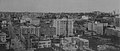 Image:Seattle skyline 1910.jpg
 -
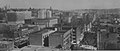 Image:Seattle - Cabin to Skyscraper 1910.jpg
 -
 Seattle skyline 1910 panorama.jpg


Graphist opinion:
Made panorama from the two photographs, was a rather tricky one considering both the originals were so old, however I think it was worth it as you can see the skyline as a whole now! Hope this helps -- Tango22 02:06, 3 April 2008 (GMT)
Done Microphone of WHBQ
[edit]Could it be possible to detour this image, like this Image:KRLD.jpg?
Article(s):
Requested by: -- Waylon 10:59, 25 March 2008 (UTC)
- Here it is. historicair 16:43, 9 April 2008 (UTC)
- Thanks! Waylon 13:25, 10 April 2008 (UTC)
Done SVG cleanup needed
[edit]
Request: Could someone clean code of the picture?-- QWerk 19:02, 28 March 2008 (UTC)
Graphist opinion:
- Size halfed by vacuuming unused definitions. More improvements could probably be done by cloning parts of the image (one of the eagle wings/legs, all the stars etc. but that (unlike the vacuuming) would require actuall work, 784kB isn't that bad. /Lokal_Profil 19:55, 28 March 2008 (UTC)
- I tried searching online to read about cloning, but I couldn't find. Can you please explain this to me, how it works? I don't know about svg that much, but would love to. Thanks. --Jak 00:14, 29 March 2008 (UTC)
- Cloning basically means that you take an object (or a group of objects) and make a copy of it. This copy will not contain the actual code but will just point to the original (hence the smaller file size). Thus if you do any changes to the original these will happen with the clone as well. The downside is that you are limited in how you can manipulate the clone, i.e. you can resize it, rotate it and twist it but you can't change it's colour or redraw any of the objects. The best way to figure out how it works is probably by looking how a image such as Image:Flag of Europe.svg is done. However for this particular image I'm not sure it's really worth it. Found a tutorial on [5] on cloning in inkscape which might be usefull. /Lokal_Profil 01:01, 29 March 2008 (UTC)
- Thanks for the info... Out of curiosity, I started working on this image to see how much size reduction can be made. Still working on it, If I ever finish it, I will post it here... Thanks again. --Jak 13:28, 31 March 2008 (UTC)
- Cloning basically means that you take an object (or a group of objects) and make a copy of it. This copy will not contain the actual code but will just point to the original (hence the smaller file size). Thus if you do any changes to the original these will happen with the clone as well. The downside is that you are limited in how you can manipulate the clone, i.e. you can resize it, rotate it and twist it but you can't change it's colour or redraw any of the objects. The best way to figure out how it works is probably by looking how a image such as Image:Flag of Europe.svg is done. However for this particular image I'm not sure it's really worth it. Found a tutorial on [5] on cloning in inkscape which might be usefull. /Lokal_Profil 01:01, 29 March 2008 (UTC)
- I tried searching online to read about cloning, but I couldn't find. Can you please explain this to me, how it works? I don't know about svg that much, but would love to. Thanks. --Jak 00:14, 29 March 2008 (UTC)
Done Equirect projection map of Libya
[edit]


Warning: Please don't crop the image! The top,right,bottom and left of the image are calculated so it can be used for a map template.
Request: Could you colour the sea and the surrounding countries and possibly Libya (with a better colour) as well. I couldn't do it in Inkscape. Thanks. Hakeem.gadi 09:07, 1 April 2008 (UTC)
Graphist opinion:
- Did a version, feel free to change around the colours. All of the objects with "other land" colours have been grouped together so that you only need to change colour in one place. And yes the pink doesn't go well with the surrounding colours but I figured you were mainly looking for the tecnical solution./Lokal_Profil 13:25, 1 April 2008 (UTC)
- If the sea is sea coloured one could possibly remove the "Mediterranean Sea" text to make the map usable on non-english wikipedias. /Lokal_Profil 13:28, 1 April 2008 (UTC)
- Thanks a bundle. I really appreciate it. Thanks. Hakeem.gadi 12:49, 2 April 2008 (UTC)
- I added another one with CIA factbook color theme (and removed the text). --Jak 14:26, 2 April 2008 (UTC)
- Much better colours =) /Lokal_Profil 17:00, 2 April 2008 (UTC)

Article(s): w:fr:Danube (for example)
Request: The border between Bulgaria and Turkey is missing. Maybe we should also add Kosovo. Thank you for the correction. -- BrightRaven 09:55, 8 April 2008 (UTC)
Graphist opinion:


Article(s): en:Vincent Van Gogh, en:smoking, etc.
Request: I tried nominating this as a featured picture, but it only got a comment about the contrast being too low. What can be done to improve this? Peter Isotalo 07:29, 10 April 2008 (UTC)
Graphist opinion:
- Gimp-ed the curve levels to improve black and white levels. ;-) Actam 08:16, 10 April 2008 (UTC)
- Much oblige! Do you think it's worth nominating as a featured picture?
- Peter Isotalo 06:09, 11 April 2008 (UTC)
Done Didymoteicho Fortress
[edit]
Article(s):To be added to Didymoteicho article
Request: Help! It wasn't upside down when I uploaded it! I don't know what happened! Can you help? -- Kafka Liz 00:12, 5 May 2008 (UTC)
Graphist opinion: So, what can I do to help you. To make the image back to its normal position? Let me know first. Then if I can, I will try to help. Ivan Akira 07:51, 5 May 2008 (UTC)
I will take this job. For detail, refer to en:User_talk:Ivan_Akira#Didymoteicho. Ivan Akira 05:39, 6 May 2008 (UTC)
Here are my fixes to your image, there are 2 of them which is the correct one that you will gonna use?
What do you think, do you want me to replace the Image:Didymoteicho2.jpg? With one of the image above? Ivan Akira 06:14, 6 May 2008 (UTC)
- The one on the right is the correct one. If you can just replace the image, Image:Didymoteicho2.jpg, that would be great. Thank you so much! Kafka Liz 14:06, 6 May 2008 (UTC)
- There is a template that will mark images for rotation: {{Rotate}}, I think they do this from a commandline so the rotation is lossless -- not that this wasn't fun.... -- carol 07:33, 7 May 2008 (UTC)
- Alright, it's done (I'm sorry that I should revise some upload so it's have a little mess in the history section). Ivan Akira 12:32, 8 May 2008 (UTC)
- There is a template that will mark images for rotation: {{Rotate}}, I think they do this from a commandline so the rotation is lossless -- not that this wasn't fun.... -- carol 07:33, 7 May 2008 (UTC)
Done Wrong Inner German border
[edit]
In this picture the border between East and West Germany in this image is not at all where it should be, see en:Inner German border. It is just some kind of circle segment. en:West Berlin ist also misssing (i.e. a part of en:East Germany).
I contacted the author twice (see User talk:Bože pravde#Wrong Inner German border and en:User talk:Bože pravde#Wrong Inner German border), but he is not reacting. Can anyone help please? --Abe Lincoln 08:54, 14 March 2008 (UTC)
- Looks to me like it's been fixed. - Jmabel | talk 01:59, 24 March 2008 (UTC)
Done CoA of the Government of Gibraltar
[edit]-
To be converted to SVG
-
 The the castle and key can be taken from here
 -
 British heraldry can be taken from here


Article(s): Template:Politics of Gibraltar, Template:Gibraltar Chief Minister
Request: Could someone please create an SVG version of the Coat of arms of the Government of Gibraltar? The current version on wikipedia has a poor resolution and the articles where it is used would benefit from the conversion. If you could contact me back on my talk page I would really appreciate it. Thanks. -- Gibmetal77 21:57, 15 April 2008 (UTC)
- Please, notice that the heraldic description specifies a castle ...masoned and ajouré of Sable.. Also, remeber that heraldic rules demands figures occupe as much surface as possible (key is then too small), good luck, buena suerte! rgds,--SanchoPanzaXXI 18:54, 16 April 2008 (UTC)
- I will take this work, show you results asap...--SanchoPanzaXXI 11:40, 21 April 2008 (UTC)
Graphist opinion:
 here it is, hope you like it. Some remarks: After some heraldist recommendations, reflects and shadows are avoided to keep the purity of the traditional heraldic colors. The only exception I introduced is the blue-sky, not use in Europe but in overseas. Also notice than due to copyright, this is a "wiki" flavoured version of an official insignia, thus accurate reproduction is not recommended. Regards, --SanchoPanzaXXI 20:44, 22 April 2008 (UTC)PS: I invite people to summit their request to our heraldic workshop, specialised in civic heraldry.
- That's just brilliant. Thank you very much! --Gibmetal 77talk 22:44, 22 April 2008 (UTC)
Jennifer Love Hewitt portrait
[edit]Request: This image of Jennifer seems "flat" especially compared to the earlier used Image:JenniferLoveHewitt.jpg, which unfortunately is a rather poor composition. I guess the lighting of the location was less than ideal. I presume this can easily be cleaned up just a little bit, and it would be a much more flattering image that could probably surpass the our earlier flickr image. Any takers? -- TheDJ 13:07, 20 March 2008 (UTC)
Graphist opinion: Image was underexposed making it look flat/washed out and black levels not high enough. Improved the contrast between the background and her, increased levels to reduce washed out look of the image. Slightly refocused and colours enhanced in LAB colour. Hope this helps! ;D -- Tango22 01:24, 3 April 2008 (GMT)
Merging images into an icon for b:First Aid
[edit]Article(s): It will be used as an icon for b:First Aid once it (hopefully) becomes a Featured Book.
Request: I'd like the Globe as the back ground with the star of life over top, and offset (ie opposite of the combo shown). As well, if anyone feels up to re-doing the star of life icon with shiny Nuvola-like flair, feel free to do so, and use that instead (and remake the combo at the right). I'm definitely up for learning how to do this sort of thing myself, so if you get this done, can you let me know what software you used so I can try to mimic your work? Thanks a bunch! – Mike.lifeguard | @en.wb 09:16, 22 November 2007 (UTC)
Graphist opinion:
- I created the image at the right, I'm not sure if it's what you were looking for. To "Nuvola-flair" the star of life icon I merely added a gradient shape to the top and a shadow behind - it isn't perfect but hopefully it's close enough ;) If someone else comes up with something better feel free to upload over top of my version.
To Mike.lifeguard - I use the free program Inkscape to do my vector work, though you can use programs like Adobe Illustrator and such to export vector graphics. Feel free to drop me a note on my talk page if you want any more info :) -- Editor at Large • talk 23:25, 22 November 2007 (UTC)
- I thought the idea was that of Image:Globe-Star of life.svg? Haven't put a glare in mine though/Lokal_Profil 23:30, 22 November 2007 (UTC)
- *cough*, you're right of course... I fixed my version. I guess I didn't read the description properly :P -- Editor at Large • talk 23:45, 22 November 2007 (UTC)
- At the same time as I updated my image to use you're flair =). I'll mark mine as a dupe. /Lokal_Profil 23:47, 22 November 2007 (UTC)
- Heh, great minds think alike I suppose! Well it was a great team effort, hopefully Mike.Lifegard likes it -- Editor at Large • talk 23:50, 22 November 2007 (UTC)
- At the same time as I updated my image to use you're flair =). I'll mark mine as a dupe. /Lokal_Profil 23:47, 22 November 2007 (UTC)
- *cough*, you're right of course... I fixed my version. I guess I didn't read the description properly :P -- Editor at Large • talk 23:45, 22 November 2007 (UTC)
- Actually, I liked the version with the star of life big and the globe over top, so I switched Lokal Profil's version to that... or something. Forgive me for uploading over top, but it would have been deleted anyway. – Mike.lifeguard | @en.wb 18:38, 23 November 2007 (UTC)
COA of Kiribati
[edit]-
 PNG
PNG -
SVG

Article(s): Kiribati and all related articles.
- I redrew the png as an svg.
- I don't think mine is too great. Anyone care to help improve it? Thank you.--Indolences 16:16, 28 February 2007 (UTC)
- According to that license, a GIF version of the vector graphic from that website is allowed on Wikipedia. I think creating an SVG version violates the copyright. Maybe somebody else can look into this as well.↔NMajdan•talk 17:57, 28 February 2007 (UTC)
- Can a Coat of Arms of a country be copyrighted? It can always be said that it was based off of any of these images, as it would be true. -Indolences 18:13, 28 February 2007 (UTC)
- Yes and no. The idea or blazon behind the image cannot be copyrighted but a particular artist's version of the insignia can be. Wikipedia practice seems to be that as long as it is not a direct duplicate of a copyrighted version, we'll be fine. Valentinian T / C 23:35, 28 February 2007 (UTC)
- Can a Coat of Arms of a country be copyrighted? It can always be said that it was based off of any of these images, as it would be true. -Indolences 18:13, 28 February 2007 (UTC)
- Okay so I should make it look more like this? As it is on the government website I would think it would not be "copyrighted". -Indolences 05:45, 2 March 2007 (UTC)
- This looks like a good version to base a new image on. From a heraldic perspective, I'd say that the idea about claiming copyright for an official coat of arms image or flag is meaningless, since these images are owned and used by nations. The U.S. flag was designed by somebody, but nobody considers this image off-limits to Wikipedia, no matter that the first person to add the 50th star can't have been dead for 70 years. Unfortunately, U.S. laws weren't designed to take this situation into account. The legal situation behind such images is very tricky and I'd be surprised if traditional encyclopedias didn't simply use such images without consulting others first. But if you create your own image inspired by another image, there'll be no problems at all. If anybody is game for it, a new .svg version of the coat of arms of Denmark would also be very welcome. I'm not the biggest fan of the current .svg version and a better one would be much appreciated. Valentinian T / C 12:27, 13 March 2007 (UTC)
- According to that license, a GIF version of the vector graphic from that website is allowed on Wikipedia. I think creating an SVG version violates the copyright. Maybe somebody else can look into this as well.↔NMajdan•talk 17:57, 28 February 2007 (UTC)
Request : Trying to get rid of car in front of Buckingham Palace
[edit]-
 the original version
 -
 my first attempt to remove the car


Article(s):
Request: I'd like to get rid of the Mercedes car but leave the London cab's in the background. I tried the "Stamp Tool" in PhotoFiltre already but I'm not happy with the results so far. As a source I copied the picture and flipped it along the vertical axis. Then I patched the tarmac from the flipped over copy back into the original picture. It turned out quite tricky to "replace" the missing parts of the last cab on the right hand side and to complete the lamp posts, which are covered by the Merc on the original picture. Ideally also the silver car parked in front the cabs would go. If someone knows how, I'd be grateful for any hints on basic techniques or especially for PhotoFiltre.
Graphist opinion: I don't know about PhotoFiltre, but you need to use some kind of smoothing to blur the obviously edited areas so there are no sharp edges. Also, I guess the pavement comes out as far as the lamp post, and is inset for the taxi rank. For a realistic shop though, you'd really need to know what's missing so you can draw it back in. Another or two would help see what's behind that car, see if you can find some more angles via google earth Bitplane 09:33, 2 May 2008 (UTC)
- Hey, this is interesting, I'd like to help you Shakespr98. I will try my best effort to fix it quickly. Ivan Akira 04:45, 14 May 2008 (UTC)
Hey, look at my work:

What do you think of it, does it look good to you? I have improved many aspect and maintain the resolution from the original photo. Just use the Adobe Photoshop Elements 2.0... Ivan Akira 12:47, 14 May 2008 (UTC)
Thank you Ivan, you really went downtown and created your own cab. Also the background between the trees seems to look better. I guess Bitplane is also right in saying a picture of the pavement without the cab's would allow for fancy pasting in. Unforutnately I'm now back in Germany and can't take any more pictures. Well... some reason to travel back to London :-) Thanks guys.Shakespr98 19:45, 14 May 2008 (UTC)
Article(s):Morocco, Coat_of_Arms_of_Morocco...
Request: Can anyone please create an SVG version for the coat of arms of Morocco? The current version has a poor resolution. thanks! -- Xiquet 13:12, 26 April 2008 (UTC)
- could you please provide a written sourced description? is that the official drawing?, thank you, --SanchoPanzaXXI 20:51, 28 April 2008 (UTC)
- This previous image was modified from Vector-images.com, The current one used on wikipedia is the official drawing used on the government site; Sorry but I didn't find any written description; Saludos --Xiquet 18:41, 29 April 2008 (UTC)
- Wirtten heraldic descriptions (called blazon) are very important to help heraldic interpretation...here is the official one [6], as it states, field should be in gules. Pelase, let me some time to further research to confirm this and drawing, rgds, --SanchoPanzaXXI 10:46, 1 May 2008 (UTC)
- Sorry, but I don't think is the official, Please take a look to the Moroccan Passport, the CoA is simliar to the current new update of the image, take your time --Xiquet 11:17, 1 May 2008 (UTC)
- I founed a clear CoA on the government website [7], I think you were right, hope it can help you on the drawing; I will update the current Commons image; thank you --Xiquet 19:09, 2 May 2008 (UTC)
- Hello, I have had some problemas with my PC last days, now fixed, I'll try to finish this drawing by this week. Thank you for your patience, --SanchoPanzaXXI 14:18, 12 May 2008 (UTC)
Graphist opinion:
 , here it is, hope you like it. Rgds, --SanchoPanzaXXI 23:23, 13 May 2008 (UTC)
- That's so cool, thanks a lot! --Xiquet 18:33, 15 May 2008 (UTC)
Photoelectric Effect
[edit]

Article(s):
Request: The first image is questioned by the number of eletrons' arrows. Well, I didn't understand the three arrows, two isn't better? In the second, the inverse was done. It not still problematic? -- JP Watrin 02:19, 21 December 2007 (UTC)
Graphist opinion:
Auditory cortex diagram
[edit]


Article(s): w:Primary auditory cortex
Request: Redo the first in the style of the second. That brain is not even the right shape o___O – Mike.lifeguard | @en.wb 21:32, 5 December 2007 (UTC)
Graphist opinion: Had a shot at it, it required a fair amount of artistic licence to translate the rough areas onto a more detailed image, if anyone knows of a better reference image, I'd be happy to make alterations. I'm new to the whole posting on wikimedia, so if anyone can get the image into its rightful place on the w:Primary auditory cortex page please do, hopefully I'll be able to get it to work with a few more attempts (time to do some reading!) User:james.mcd.nz
- Cleaned up the code and moved the legends to the image description page. /Lokal_Profil 16:58, 15 December 2007 (UTC)
Title
[edit]
Request: I'd like the picture to be horizontal. -- Simon Shek 10:01, 17 December 2007 (UTC)
Graphist opinion:
- I'm guessing you meant you wanted the image straightened horizontally. James.mcd.nz 17:25, 18 December 2007 (UTC)
- New version looks good. Unless the original uploader minds you should probably upload the new image over the old one. Also the licensing of the new one is wrong but I assume thats due to copy pasting =). /Lokal_Profil 02:00, 19 December 2007 (UTC)
- Marked the temporary version for deletion. /Lokal_Profil 14:30, 19 May 2008 (UTC)
- New version looks good. Unless the original uploader minds you should probably upload the new image over the old one. Also the licensing of the new one is wrong but I assume thats due to copy pasting =). /Lokal_Profil 02:00, 19 December 2007 (UTC)
SVG will not display
[edit]
Request: This image will not display in the medium view, though it will display inside article and full. Any help? -- Knulclunk 02:48, 30 January 2008 (UTC)
Graphist opinion: open your file with an editor like notepad++ (on windows) and look at his end: you will see a string like:
<i:pgf  id="adobe_illustrator_pgf">
	<![CDATA[
	eJzsvXuTHMeRJ/g/zfgd6v4YM2lv1chHZGak7mzNqh/Qco0SZSS1q72xNVoTaJLY6Qe3AYyW9+nP
etc.
this is an embeded raster file! You need to make a proper conversion without including it. Morgoth666 09:46, 30 January 2008 (UTC)
- I cleaned up your svg file --SuperManu SuperMessage 09:17, 1 February 2008 (UTC)
Reptile plate
[edit]
Request: I scanned and uploaded this illustration from an old encyclopedia. It is almost 5MB; I also uploaded some less compressed versions previously (see page history). Please could you comment on it? What should I have done better, and what could still be done to improve it? Unfortunately it is blurred at the left edge as it is still bound in the book and would not lie flat on the scanner. Could anything be done about that? Strobilomyces 20:15, 11 February 2008 (UTC)
Graphist opinion: 9,604 × 13,600 pixels is a generous size for an image -- as this image contains so much information, I suggest that the best way to 'improve it' is to know that you have uploaded a very generous image (both in pixel size and the information it contains) to the commons so that others can have access to it -- or in other words, relax and don't worry about the warning. -- carol 23:40, 12 February 2008 (UTC)
- It's especially true for a image like this where other users might want to extract parts and upload as separate images. Tagged the image wiht {{Extract image}}. /Lokal_Profil 00:25, 13 February 2008 (UTC)
SVG a coat of arms
[edit]

Articel(s): en:Variations of the field
Request: SVGify and remove useless background. 68.39.174.238 02:43, 28 November 2007 (UTC)
Opinion:
http://reisio.com/temp/ca.svg:
<?xml version="1.0" standalone="no"?>
<!DOCTYPE svg PUBLIC "-//W3C//DTD SVG 1.1//EN" "http://www.w3.org/Graphics/SVG/1.1/DTD/svg11.dtd">
<svg
	height="538"
	width="476"
	version="1.1"
	xmlns="http://www.w3.org/2000/svg"
	xmlns:xlink="http://www.w3.org/1999/xlink">
	<desc>"Clackson arms"</desc>
<!--
	this text is in the public domain
-->
	<g
		stroke="black"
		stroke-width="1">
		<g
			fill="white">
			<path
				d="M 10.5,10.5 C 10.5,10.5 10.5,200.50382 10.5,255.5 C 10.5,380.49547 126.41967,497.73612 237.5,527.5 C 237.5,472.49576 237.5,10.5 237.5,10.5 L 10.5,10.5 z"
				id="w" />
		</g>
		<g
			fill="yellow">
			<path
				d="M 10.5,10.499998 C 10.5,10.499998 10.5,37.949141 10.5,44.343748 L 237.5,248.5 L 130.4375,10.499998 L 10.5,10.499998 z M 237.5,248.5 L 134.5625,475.59375 C 166.81762,499.95048 202.4017,518.09544 237.5,527.5 C 237.5,497.81686 237.5,378.66491 237.5,248.5 z M 237.5,248.5 L 24.1875,330.96875 C 33.89109,357.95091 48.30098,383.68746 66.03125,407.21875 L 237.5,248.5 z M 237.5,248.5 L 10.5,163.625 C 10.5,201.9217 10.5,226.86706 10.5,248.5 L 237.5,248.5 z"
				id="y" />
		</g>
		<g
			transform="matrix(-1,0,0,1,475,0)">
			<use
				fill="yellow"
				xlink:href="#w" />
			<use
				fill="white"
				xlink:href="#y" />
		</g>
		<path
			fill="blue"
			d="M 237.5 152.96875 L 160.125 248.5 L 237.5 344.03125 L 314.875 248.5 L 237.5 152.96875 z" />
	</g>
</svg>
¦ Reisio 02:12, 29 November 2007 (UTC)
- Looks good. Reisios svg image should be able to replace the png. /Lokal_Profil 20:00, 29 November 2007 (UTC)
the unsatisfying edited version
-
 the original picture
 -
 the new version
.jpg)

.svg)
![[1]](https://upload.wikimedia.org/wikipedia/en/6/65/Subspace_Node_Map_Freespace.jpg)
![[2]](https://en.wikipedia.org/wiki/Image:Tree_of_life_1500px_coloured.png)
![[3]](https://ja.wikipedia.org/wiki/%E5%88%A9%E7%94%A8%E8%80%85%E2%80%90%E4%BC%9A%E8%A9%B1:Was_a_bee#.E7.94.BB.E5.83.8F:Solar_eclipse_.28ja.29.svg)
![[4]](http://www.esanet.fi/huittisten.invalidit/images/Vaakuna_GIF_-orginaali_WEB.gif)
Article(s): Formica Leo
Request: Light has been corrected separately for each part of the composition, but the limit of the correction along the basis of the cone is too much geometric. Original picture is this one-- B.navez 14:55, 30 March 2008 (UTC)
Graphist opinion: ![]() Done by myself (I have learned how to do now). --B.navez 18:26, 23 May 2008 (UTC)
Done by myself (I have learned how to do now). --B.navez 18:26, 23 May 2008 (UTC)