Commons:Quality images candidates/Archives October 06 2020
Jump to navigation
Jump to search

-

- Nomination Tarns by Yeats Ridge Hut, West Coast --Podzemnik 04:21, 4 October 2020 (UTC)
- Promotion Good quality.--Agnes Monkelbaan 04:37, 4 October 2020 (UTC)
-

- Nomination Tarns by Yeats Ridge Hut, West Coast --Podzemnik 04:21, 4 October 2020 (UTC)
- Promotion Good quality.--Agnes Monkelbaan 04:35, 4 October 2020 (UTC)
-

- Nomination Ice on a tarn by Yeats Ridge Hut --Podzemnik 04:21, 4 October 2020 (UTC)
- Promotion
 Support Good quality -- Johann Jaritz 04:41, 4 October 2020 (UTC)
-

- Nomination Mt Ross in Diedrichs Range, West Coast --Podzemnik 04:21, 4 October 2020 (UTC)
- Promotion Support Good quality -- Johann Jaritz 04:41, 4 October 2020 (UTC)
-

-

-

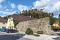
- Nomination City wall on Hauptstraße #28, Straßburg, Carinthia, Austria -- Johann Jaritz 02:55, 4 October 2020 (UTC)
- Promotion Support Good quality. --Podzemnik 04:24, 4 October 2020 (UTC)
-

- Nomination Plaque at the guesthouse Koller on Hauptstraße #28, Straßburg, Carinthia, Austria -- Johann Jaritz 02:55, 4 October 2020 (UTC)
- Promotion Support Good quality. --Podzemnik 04:24, 4 October 2020 (UTC)
-

- Nomination Guesthouse Koller and parts of the city wall on Hauptstraße #28, Straßburg, Carinthia, Austria -- Johann Jaritz 02:55, 4 October 2020 (UTC)
- Promotion Support Good quality. --Podzemnik 04:24, 4 October 2020 (UTC)
-

- Nomination Mullion at the guesthouse Koller on Hauptstraße #28, Straßburg, Carinthia, Austria -- Johann Jaritz 02:55, 4 October 2020 (UTC)
- Promotion Support Good quality. --Podzemnik 04:24, 4 October 2020 (UTC)
-
- Nomination City wall on Hauptstraße #28, Straßburg, Carinthia, Austria -- Johann Jaritz 02:55, 4 October 2020 (UTC)
- Promotion Support Good quality. --Podzemnik 04:24, 4 October 2020 (UTC)
-
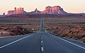
- Nomination Forrest Gump Point at sunrise. --King of Hearts 01:41, 4 October 2020 (UTC)
- Promotion Support Good quality. Good FPC candidate --Podzemnik 04:23, 4 October 2020 (UTC)
-

- Nomination View from Moro Rock Trail, Sequoia National Park. --King of Hearts 01:41, 4 October 2020 (UTC)
- Promotion Support Good quality. --Podzemnik 04:23, 4 October 2020 (UTC)
-

- Nomination View from Moro Rock Trail, Sequoia National Park. --King of Hearts 01:41, 4 October 2020 (UTC)
- Promotion Support Good quality. --Podzemnik 04:23, 4 October 2020 (UTC)
-

- Nomination View from Moro Rock Trail, Sequoia National Park. --King of Hearts 01:41, 4 October 2020 (UTC)
- Promotion Support Good quality. --Podzemnik 04:23, 4 October 2020 (UTC)
-

- Nomination View from Moro Rock Trail, Sequoia National Park. --King of Hearts 01:41, 4 October 2020 (UTC)
- Promotion Support Good quality. --Podzemnik 04:23, 4 October 2020 (UTC)
-

- Nomination Interior of Galleria Umberto I in Naples during the golden hour. --Lion-hearted85 23:05, 3 October 2020 (UTC)
- Promotion Support Good quality. -- Ikan Kekek 23:36, 3 October 2020 (UTC)
-

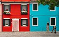
- Nomination Three colourful houses in Burano.--Lion-hearted85 23:05, 3 October 2020 (UTC)
- Promotion Good quality. --Jacek Halicki 23:39, 3 October 2020 (UTC)
-
- Nomination Close-up of three colourful houses in Burano. --Lion-hearted85 23:05, 3 October 2020 (UTC)
- Promotion Good quality. --Jacek Halicki 23:39, 3 October 2020 (UTC)
-

- Nomination Close-up of a blue-painted door in Burano. --Lion-hearted85 23:05, 3 October 2020 (UTC)
- Promotion Good quality. --Jacek Halicki 23:39, 3 October 2020 (UTC)
-

- Nomination Monumental fountain of Neptune in Municipio square, Naples. --Lion-hearted85 23:05, 3 October 2020 (UTC)
- Promotion Good quality. --Jacek Halicki 23:39, 3 October 2020 (UTC)
-
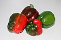
- Nomination Collected bell peppers (Capsicum annuum) -- George Chernilevsky 19:43, 3 October 2020 (UTC)
- Promotion Good quality.--Agnes Monkelbaan 04:32, 4 October 2020 (UTC)
-

-

-

- Nomination Forrest Gump Point, Monument Valley. --King of Hearts 17:46, 3 October 2020 (UTC)
- Promotion Good quality --Michielverbeek 18:36, 3 October 2020 (UTC)
-

- Nomination Moro Rock Trail, Sequoia National Park. --King of Hearts 17:46, 3 October 2020 (UTC)
- Promotion Support Good quality. --Trougnouf 19:33, 3 October 2020 (UTC)
-

- Nomination View from the Belchenflue in the Jura Mountains to the Bernese Alps in a distance of about 100 km --Milseburg 14:36, 3 October 2020 (UTC)
- Promotion Support good quality. --Fischer.H 17:16, 3 October 2020 (UTC)
-

- Nomination 360° panoramic --Wilfredor 14:27, 3 October 2020 (UTC)
- Promotion Support Good quality.--Famberhorst 15:58, 3 October 2020 (UTC)
-

-

-

- Nomination Maria with the Child, church in Žužemberk, Slovenia --PetarM 13:58, 3 October 2020 (UTC)
- Promotion Support Good quality.--Famberhorst 15:44, 3 October 2020 (UTC)
-

- Nomination Bell tower in the old town of Split, Croatia --MB-one 11:26, 3 October 2020 (UTC)
- Promotion Support Good quality.--Famberhorst 16:00, 3 October 2020 (UTC)
-

- Nomination Ruisseau du Vialais --Christian Ferrer 11:09, 3 October 2020 (UTC)
- Promotion Support Good quality. --Aristeas 12:34, 3 October 2020 (UTC)
-

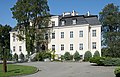
- Nomination Château Sainte-Anne in Auderghem, Belgium --Trougnouf 10:34, 3 October 2020 (UTC)
- Promotion Support --Lion-hearted85 23:02, 3 October 2020 (UTC)
-
- Nomination Leningrad region. Vyborg district.. Glades. Functional and historical complex of the Uusikirkko Lutheran Church. Western gate --Александр Байдуков 10:18, 3 October 2020 (UTC)
- Decline
 Oppose quite nice compo but the cross, an important item within the image, is overexposed --Christian Ferrer 10:57, 3 October 2020 (UTC)
-

- Nomination Sunset over the lake and Port Dusano Manerba del Garda. --Moroder 10:00, 3 October 2020 (UTC)
- Promotion Support Good quality. --Lion-hearted85 22:58, 3 October 2020 (UTC)
-

- Nomination Portal of the Duomo by Gasparo Cairano and Antonio Mangiacavall. --Moroder 10:00, 3 October 2020 (UTC)
- Promotion Support Good quality. --Christian Ferrer 11:00, 3 October 2020 (UTC)
-

- Nomination Santa Maria Annunziata church in Salò. Interior. --Moroder 10:00, 3 October 2020 (UTC)
- Promotion Support Good quality. --Lion-hearted85 22:59, 3 October 2020 (UTC)
-

-

- Nomination Historic cowshed-barn on the Karłowiec farm. Kończyce Wielkie, Silesian Voivodeship, Poland. --Halavar 09:37, 3 October 2020 (UTC)
- Promotion Support Good quality.--Famberhorst 15:52, 3 October 2020 (UTC)
-

-

-

- Nomination Palace ruins. Tworków, Silesian Voivodeship, Poland. --Halavar 09:37, 3 October 2020 (UTC)
- Promotion Support Good quality. --Christian Ferrer 11:01, 3 October 2020 (UTC)
-

- Nomination Red Cloister Abbey Art Center (Auderghem, Belgium) --Trougnouf 09:23, 3 October 2020 (UTC)
- Promotion Support Good quality. -- Crep171166 09:42, 3 October 2020 (UTC) Support Good quality. --Halavar 09:51, 3 October 2020 (UTC)
-
-

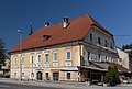
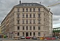
- Nomination Listed houses Kanalstrasse 28 (left) and Neckarstrasse 55 (right) in Esslingen am Neckar, Germany. --Aristeas 09:01, 3 October 2020 (UTC)
- Promotion Support Good quality.--Famberhorst 15:46, 3 October 2020 (UTC)
-
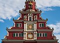
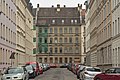
- Nomination Northern gable of the old townhall in Esslingen am Neckar, Germany. --Aristeas 09:01, 3 October 2020 (UTC)
- Promotion Support Good quality.--Famberhorst 15:48, 3 October 2020 (UTC)
-

- Nomination eggs of slender-billed gull - Oeufs de Goéland railleur --Ercé 08:43, 3 October 2020 (UTC)
- Promotion Support GQ --Palauenc05 08:53, 3 October 2020 (UTC)
-
- Nomination Saint Michael Archangel church in Krzyżowa --Jacek Halicki 08:10, 3 October 2020 (UTC)
- Promotion Support Good quality. --Aristeas 09:03, 3 October 2020 (UTC)
-
- Nomination Palace in Krzyżowa 1 --Jacek Halicki 08:10, 3 October 2020 (UTC)
- Promotion Support GQ --Palauenc05 08:33, 3 October 2020 (UTC)
-

- Nomination Palace in Krzyżowa 2 --Jacek Halicki 08:10, 3 October 2020 (UTC)
- Promotion Support Good quality.--Famberhorst 15:51, 3 October 2020 (UTC)
-

- Nomination Palace in Krzyżowa 3 --Jacek Halicki 08:10, 3 October 2020 (UTC)
- Promotion Support Good quality. --Tournasol7 09:39, 3 October 2020 (UTC)
-

- Nomination Marine Drive Kochi Night View --Mydreamsparrow 08:03, 3 October 2020 (UTC)
- Decline Overexposed --Jacek Halicki 08:14, 3 October 2020 (UTC)
-

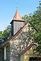
- Nomination Wayside cross in Aach (near Trier) --Palauenc05 07:53, 3 October 2020 (UTC)
- Promotion Good quality. --Jacek Halicki 08:13, 3 October 2020 (UTC)
-

- Nomination Chemin du Moulin in the Sonian Forest (Watermael-Boitsfort, Belgium) --Trougnouf 07:40, 3 October 2020 (UTC)
- Promotion Good quality. --Jacek Halicki 08:13, 3 October 2020 (UTC)
-

- Nomination Goirle-NL, windmill: windmolen De Visscher --Michielverbeek 06:59, 3 October 2020 (UTC)
- Promotion Support GQ --Palauenc05 08:11, 3 October 2020 (UTC)
-

- Nomination Goirle-NL, church: the Sint-Johannes Onthoofdingkerk --Michielverbeek 06:59, 3 October 2020 (UTC)
- Promotion Support GQ --Palauenc05 08:11, 3 October 2020 (UTC)
-

- Nomination Panoramic view of Bratislava, Slovakia --Poco a poco 06:38, 3 October 2020 (UTC)
- Promotion Support Good quality. --Podzemnik 06:51, 3 October 2020 (UTC)
-

- Nomination Primate's Palace, Bratislava, Slovakia --Poco a poco 06:38, 3 October 2020 (UTC)
- Promotion Support Good quality. --Podzemnik 06:49, 3 October 2020 (UTC)
-

- Nomination St. Martin's Cathedral, Bratislava, Slovakia --Poco a poco 06:38, 3 October 2020 (UTC)
- Promotion Support Good quality. --Podzemnik 06:49, 3 October 2020 (UTC)
-

-

-

-

-

-

- Nomination Gargoyle of the Saint Hippolytus church in Thonon-les-Bains, Haute-Savoie, France. --Tournasol7 06:12, 3 October 2020 (UTC)
- Promotion Support Good quality. --Podzemnik 06:47, 3 October 2020 (UTC)
-

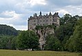
- Nomination Castle of Saint-Alban-sur-Limagnole, Lozere, France. --Tournasol7 06:12, 3 October 2020 (UTC)
- Promotion Support Good quality. --Podzemnik 06:47, 3 October 2020 (UTC)
-

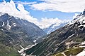
- Nomination Lac d'Avoriaz in commune of Morzine, Haute-Savoie, France. --Tournasol7 06:12, 3 October 2020 (UTC)
- Promotion Support Good quality. --Podzemnik 06:47, 3 October 2020 (UTC)
-

- Nomination View of Póvoa de Lanhoso, Minho, Portugal. --Tournasol7 06:12, 3 October 2020 (UTC)
- Promotion Support Good quality. --Podzemnik 06:47, 3 October 2020 (UTC)
-

- Nomination Caltha palustris in Avoriaz, Haute-Savoie, France. --Tournasol7 06:12, 3 October 2020 (UTC)
- Promotion Support Good quality. --Podzemnik 06:47, 3 October 2020 (UTC)
-

- Nomination Flower buds of a Hedera hibernica Location De Famberhorst. Focus stack of 19 photos.
--Famberhorst 05:38, 3 October 2020 (UTC) - Promotion Support Good quality. --Tournasol7 06:13, 3 October 2020 (UTC)
- Nomination Flower buds of a Hedera hibernica Location De Famberhorst. Focus stack of 19 photos.
-

- Nomination Shell of a Jagged False Limpet, Siphonaria laciniosa --Llez 05:06, 3 October 2020 (UTC)
- Promotion Support Good quality.--Famberhorst 05:31, 3 October 2020 (UTC)
-

-

- Nomination Laetiporus sulphureus. Location, Stuttebosch in the lime valley. Friesland province.
--Agnes Monkelbaan 04:27, 3 October 2020 (UTC) - Promotion Support Good quality. --XRay 05:09, 3 October 2020 (UTC)
- Nomination Laetiporus sulphureus. Location, Stuttebosch in the lime valley. Friesland province.
-

- Nomination Forest biotope. Location, Stuttebosch in the lime valley. Friesland province.
--Agnes Monkelbaan 04:27, 3 October 2020 (UTC) - Promotion Support Good quality. --XRay 05:09, 3 October 2020 (UTC)
- Nomination Forest biotope. Location, Stuttebosch in the lime valley. Friesland province.
-

- Nomination Taj Mahal, India (by A Ghosh 2020) --Atudu 02:26, 3 October 2020 (UTC)
- Decline Distorted, heavy CAs --Llez 05:09, 3 October 2020 (UTC)
-

- Nomination Panoramic view of Toledo. --King of Hearts 23:57, 2 October 2020 (UTC)
- Promotion Support Good quality. --Podzemnik 06:07, 3 October 2020 (UTC)
-

- Nomination Panoramic view of Toledo. --King of Hearts 23:57, 2 October 2020 (UTC)
- Promotion Good quality --Llez 05:13, 3 October 2020 (UTC)
-
-

- Nomination Dubrovnik old city church bell tower from the city wallsI, the copyright holder of this work, hereby publish it under the following license:This image was uploaded as part of Wiki Loves Monuments 2020. --RajashreeTalukdar 10:24, 2 October 2020 (UTC)
- Decline Oppose Tilted, it looks like you used some kind of filter --Podzemnik 06:14, 3 October 2020 (UTC)
-
-

- Nomination Split Cathedral Bell Tower from the Vestibule I, the copyright holder of this work, hereby publish it under the following license:This image was uploaded as part of Wiki Loves Monuments 2020. --Sumitsurai 10:16, 2 October 2020 (UTC)
- Promotion Good quality. And interesting image. --Argenberg 10:25, 2 October 2020 (UTC) Support Good quality. I've fixed the categories, please have a look --Podzemnik 06:14, 3 October 2020 (UTC) Support Good quality. --Podzemnik 06:44, 3 October 2020 (UTC)
-

-

-

-

-

- Nomination Standing stone, now grounded, thought to be one of a megalithic stone circle, near the Overton Centre in Overchurch Park, Upton, Wirral. --Rodhullandemu 08:43, 2 October 2020 (UTC)
- Promotion Support Good quality. --Podzemnik 06:44, 3 October 2020 (UTC)
-

-
-

- Nomination Saint Felix church in Landos, Haute-Loire, France. --Tournasol7 06:26, 2 October 2020 (UTC)
- Promotion Support Good quality. --Podzemnik 06:44, 3 October 2020 (UTC)
-
- Nomination Kiepenkerldenkmal (August Schmiemann, 1896) at the Spiekerhof in Münster, North Rhine-Westphalia, Germany --XRay 03:53, 2 October 2020 (UTC)
- Promotion Support Good quality -- Johann Jaritz 04:02, 2 October 2020 (UTC)
 Comment Good sharpness and good colors, but very distorted und too disturbing shadow at the right. -- Spurzem 21:19, 2 October 2020 (UTC)
I'll fix it - if possible. --XRay 08:56, 3 October 2020 (UTC)
-

- Nomination Shlisselburg. Nicholas church. Facade --Александр Байдуков 02:10, 2 October 2020 (UTC)
- Promotion Support Good quality. --Podzemnik 06:44, 3 October 2020 (UTC)
-
- Nomination SEL'tso-Hill. Park alleys of the Shakhovsky estate. Crowns of old trees of the estate --Александр Байдуков 02:10, 2 October 2020 (UTC)
- Promotion Support Good quality. --Podzemnik 06:44, 3 October 2020 (UTC)
-

- Nomination Pacific Black Duck (Anas superciliosa) with ducklings --Bald white guy 21:32, 1 October 2020 (UTC)
- Promotion Nice photo, but please dial down the highlights a bit. Part of the mother duck's head is blown. -- Ikan Kekek 23:19, 1 October 2020 (UTC)
 Done Hopefully better. Sorry I'm not so hot at the editing side of things. Bald white guy 02:55, 3 October 2020 (UTC)
It's somewhat better, but I still think the highlights are too bright and in some cases lacking in details. Can you recover more details? -- Ikan Kekek 08:08, 3 October 2020 (UTC) DoneThanks. Further update reducing exposure and crunching Dynamic Range. A little dark but more detail. Bald white guy 10:10, 3 October 2020 (UTC) Support Definitely better. I'll call it good enough quality. -- Ikan Kekek 19:02, 3 October 2020 (UTC)
-

- Nomination Entrance hall of the Eureka Inn, at 7th and F Streets in Eureka, California, a four-story, 104-room Elizabethan Tudor Revival architectural style hotel, opened in 1922. --Frank Schulenburg 12:42, 1 October 2020 (UTC)
- Promotion Support Good quality and very interesting. --Aristeas 09:11, 3 October 2020 (UTC)
-
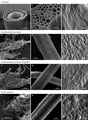
- Nomination SEM and AFM images of untreated (A)-(C), hydrothermally pretreated (D)-(F), delignified hydrothermally pretreated (G)-(I) and steam-exploded wheat straw (J)-(L). --M. Krafft 12:36, 1 October 2020 (UTC)
- Decline Oppose "Pictures must have been created by a Wikimedian" --Christian Ferrer 11:28, 3 October 2020 (UTC)
-

- Nomination Prepaired historic stonework of a counter bearing in Leipzig --Augustgeyler 10:56, 1 October 2020 (UTC)
- Promotion Support Good quality and detail. -- Crep171166 09:51, 3 October 2020 (UTC)
-

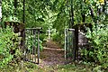
- Nomination The wall with two gates in Grodziszcze 1 --Jacek Halicki 07:28, 1 October 2020 (UTC)
- Promotion Support Good quality. --Podzemnik 06:31, 3 October 2020 (UTC)
-

- Nomination The wall with two gates in Grodziszcze 4 --Jacek Halicki 07:28, 1 October 2020 (UTC)
- Promotion Support Good quality. --Podzemnik 06:31, 3 October 2020 (UTC)
-

- Nomination The wall with two gates in Grodziszcze 5 --Jacek Halicki 07:28, 1 October 2020 (UTC)
- Promotion Support Good quality. --Podzemnik 06:31, 3 October 2020 (UTC)
-

- Nomination Pushkin. Kazan cemetery. Tombstone of G. R. Vasmund (1838-1910), Lieutenant General --Александр Байдуков 07:16, 1 October 2020 (UTC)
- Decline Oppose Blown, tilted --Podzemnik 06:31, 3 October 2020 (UTC)
-

- Nomination Putilovo. Church of the Tikhvin icon of the Mother of God. Church garden --Александр Байдуков 07:16, 1 October 2020 (UTC)
- Decline Oppose Blown sky --Podzemnik 06:31, 3 October 2020 (UTC)
-

- Nomination Park in Grodziszcze 3 --Jacek Halicki 08:05, 30 September 2020 (UTC)
- Promotion Good quality. --Moroder 10:48, 3 October 2020 (UTC)
-

- Nomination Lion statue at Plonit Alley. By User:Deror avi --Andrew J.Kurbiko 07:56, 30 September 2020 (UTC)
- Decline Insufficient quality. Tight crop, sorry --Moroder 04:13, 4 October 2020 (UTC)
-

-

-
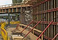
- Nomination consturcting new abutments at Leipzig-Anger-Crottendorf Halt--Augustgeyler 20:06, 27 September 2020 (UTC)
- Promotion Good quality. --Moroder 10:42, 3 October 2020 (UTC)
-

- Nomination Horseshoe Falls, viewed from Table Rock Centre in Niagara Falls, Ontario By User:Sahagunethan --Sahagunethan 18:41, 27 September 2020 (UTC)
- Promotion Good quality. --Moroder 04:10, 4 October 2020 (UTC)
-

- Nomination Open view of Whiteshell River, to the left a rocky granite shore By User:Sahagunethan --Sahagunethan 18:40, 27 September 2020 (UTC)
- Promotion Good quality. --Moroder 04:08, 4 October 2020 (UTC)
-
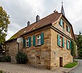
- Nomination multiple-family dwelling under a preservation order in Leipzig --Augustgeyler 17:39, 27 September 2020 (UTC)
- Promotion Support Good quality. --Aristeas 09:18, 3 October 2020 (UTC)
-
- Nomination façade of multiple-family dwelling in Leipzig Anger-Crottendorf --Augustgeyler 15:28, 27 September 2020 (UTC)
- Promotion Support Good quality. Some minor traces of CAs. --Aristeas 09:18, 3 October 2020 (UTC)
-
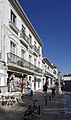
- Nomination Portugal, Alcobaça, R. Alexandre Herculano --Berthold Werner 14:11, 27 September 2020 (UTC)
- Promotion Support Good quality. --Aristeas 09:19, 3 October 2020 (UTC)
-

-
-

-

- Nomination Oak and maple alley in Boleścin 1 --Jacek Halicki 07:38, 26 September 2020 (UTC)
- Promotion Good quality. --Moroder 04:05, 4 October 2020 (UTC)
-

-

-

- Nomination WLMPopulonia – Il Castello --PROPOLI87 09:17, 25 September 2020 (UTC) Comment Vertical lines can be fixed --Moroder 05:30, 1 October 2020 (UTC)* DoneSet vertical linesPROPOLI87 11:42, 2 October 2020 (UTC)PROPOLI87PROPOLI87 11:42, 2 October 2020 (UTC)
- Promotion Good quality. --Moroder 03:41, 4 October 2020 (UTC)
- Nomination WLMPopulonia – Il Castello --PROPOLI87 09:17, 25 September 2020 (UTC)
-

- Nomination Mural by street artist Alexander Isakov of the old Holy Mary Ascension Church, which was demolished in the 1960’s --ReneeWrites 09:11, 25 September 2020 (UTC)
- Promotion
Image looks tilted CW. --Halavar 09:48, 25 September 2020 (UTC)
Uploaded a new version & fixed the tilt. --ReneeWrites 19:49, 30 September 2020 (UTC)
@Halavar: Can you let me know what you think of the new version? --ReneeWrites 22:23, 2 October 2020 (UTC) Support Good quality now. --Halavar 09:30, 3 October 2020 (UTC)


.jpg)

.jpg)

.jpg)


.jpg)

.jpg)
.jpg)

.jpg)


.jpg)


.jpg)


.jpg)
.jpg)


._Locatie,_Stuttebosch_in_de_lendevallei._27-08-2020._(actm.)_05.jpg)
_02.jpg)

.jpg)


,_Lieutenant_General.jpg)


.jpg)


.jpg)
.jpg)


.jpg)
.jpg)
Consensual review
[edit]File:POPOLUNIA_-_il_castello_esterno_5.jpg
[edit]
- Nomination WLMPopulonia – Il Castello --PROPOLI87 09:17, 25 September 2020 (UTC)
- Decline
- Oppose Not enough detail. Perhaps tilted slightly to the right. --Augustgeyler 09:39, 2 October 2020 (UTC)
- DonecorrectPROPOLI87 12:09, 2 October 2020 (UTC)PROPOLI87PROPOLI87 12:09, 2 October 2020 (UTC)
- Oppose The monument looks good, but I doubt the leaves are okay since it looks a little burned. Let's discuss. --Vincent60030 15:43, 4 October 2020 (UTC)
- Oppose Not very sharp and the blurry tree is distracting. -- Ikan Kekek 11:16, 5 October 2020 (UTC)
- Oppose Not sharp enough and low level of detail.--Augustgeyler 12:02, 5 October 2020 (UTC)
- Commentlet's decline, I corrected for the WLM, but I have other better ones than this one at the Castello di Populonia. Thank you all.PROPOLI87 13:10, 5 October 2020 (UTC)PROPOLI87PROPOLI87 13:10, 5 October 2020 (UTC)
Running total: 0 support (excluding the nominator), 4 oppose → Decline? --Ikan Kekek 11:16, 5 October 2020 (UTC)
File:Anthyllis_vulneraria_in_Avoriaz_(1).jpg
[edit].jpg)
- Nomination Anthyllis vulneraria in Avoriaz, Haute-Savoie, France. --Tournasol7 06:26, 2 October 2020 (UTC)
- Promotion
- Support Good quality. --Podzemnik 06:44, 3 October 2020 (UTC)
- Oppose} Sorry, but I disagree. Much of the image is out of focus with especially the calyx parts overexposed. --Robert Flogaus-Faust 21:53, 3 October 2020 (UTC)
- Support maybe the light is indeed a bit harsh and the highlights could be a bit decreased, but the details are not lost. Focus is acceptable IMO; Christian Ferrer 08:26, 4 October 2020 (UTC)
- Support Unquestionably a QI to me. -- Ikan Kekek 12:08, 4 October 2020 (UTC)
- Support --Palauenc05 20:51, 4 October 2020 (UTC)
Running total: 4 support (excluding the nominator), 1 oppose → Promote? --Palauenc05 20:51, 4 October 2020 (UTC)
File:A_tram_approaching_Dokk1,_Aarhus.jpg
[edit]
- Nomination A tram approaching Dokk1, Aarhus. --Liberaler Humanist 04:41, 2 October 2020 (UTC)
- Withdrawn
- Support Good quality and a good composition for showing the trams in Aarhus --Michielverbeek 05:08, 2 October 2020 (UTC)
- Oppose I disagree. Description is needed --Tournasol7 06:35, 2 October 2020 (UTC)
- I disagree with the claim that descriptions were needed. I give my files meaningfull titles that make descriptions redundant and ignore them like everyone else ignores Structured Data. We need to have a discussion about the steadily growing Number of Metadata we are supposed to enter. This is supposed to be a project about collecting Media and not a data entry game. But if it makes you happy, I pasted the title into the description field.-- Liberaler Humanist 11:24, 2 October 2020 (UTC)
- According QI guidelines: "Quality images shall have a meaningful file name, be properly categorized and have an accurate description on the file page in one or more languages. It is preferred, but not mandatory, to include an English description." --Tournasol7 12:26, 2 October 2020 (UTC)
- I disagree with the claim that descriptions were needed. I give my files meaningfull titles that make descriptions redundant and ignore them like everyone else ignores Structured Data. We need to have a discussion about the steadily growing Number of Metadata we are supposed to enter. This is supposed to be a project about collecting Media and not a data entry game. But if it makes you happy, I pasted the title into the description field.-- Liberaler Humanist 11:24, 2 October 2020 (UTC)
- Oppose Good technical quality, but still poor description. --Smial 20:55, 3 October 2020 (UTC)
- Support OK for me. --A.Savin 01:56, 4 October 2020 (UTC)
- Support 4 me 2. Christian Ferrer 08:28, 4 October 2020 (UTC)
 Weak oppose I am with Tournasol7. These added data helps others to find that picture in complex search functions. --Augustgeyler 08:56, 5 October 2020 (UTC)
- I am withdrawing this nomination for doubts over the integritiy of the vote process. As 2 opposing votes votes were cast after I added an english decription longer than to usual "copy the title-descriptions", I'm not sure if anyone is actually looking at the image. -- Liberaler Humanist 11:24, 5 October 2020 (UTC)
- Comment I did look at it carefully seconds before reviewing. --Augustgeyler 12:10, 5 October 2020 (UTC)
Running total: 3 support (excluding the nominator), 3 oppose → More votes? --A.Savin 01:56, 4 October 2020 (UTC)
File:Armand_Bayou_Nature_Center_--_Entrance_Sculpture.jpg
[edit]
- Nomination Armand Bayou Nature Center is the largest urban wilderness preserve in the United States. -- Jim Evans 12:48, 21 September 2020 (UTC)
- Promotion Comment
- Support Good quality -- Spurzem 13:11, 21 September 2020 (UTC)
- Comment Is there more space in the image frame at the top and the bottom? --GRDN711 19:56, 23 September 2020 (UTC)
- Comment @Jim Evans: Let me add further clarity to my QIBot comment above. I agree with Spurzem that your image merits a QI rating but IMHO find it too tightly cropped. If there is more image space at the top and bottom of this sculpture, please consider adding it. --GRDN711 (talk) 03:31, 4 October 2020 (UTC): Comment Not really. The picture had a specific purpose. To be the lead picture for the nature center and I wanted viewers to be able to see the logo on the ball to the degree possible. Thus the tight crop. Jim Evans 13:27, 4 October 2020 (UTC) Comment I want to thank whoever brought this nomination back to life. Jim Evans 22:51, 4 October 2020 (UTC)
Running total: 1 support (excluding the nominator), 0 oppose → Promote? --Milseburg (talk) 11:08, 4 October 2020 (UTC)
File:Wall_in_front_of_number_2_Wilbury_Avenue,_front_of_south_boundary.jpg
[edit]
- Nomination Wall on Wilbury Avenue --Bobulous 16:48, 26 September 2020 (UTC)
- Promotion
- Support Good quality. --Aristeas 07:58, 1 October 2020 (UTC)
- Oppose The sphere is showing to hard distortion. --Augustgeyler 21:18, 1 October 2020 (UTC)
- Comment This is just perspective distortion which is unavoidable from that point of view. Of course one can argue if the photographer had to take that point of view. But I would say the photographer had good reasons to do so, because he/she wanted to achieve the composition which is IMHO interesting and emphasizes (as obviously intended) the wall. In addition, the falling lines and emphasized size differences (often known as “wide-angle perspective”) really help here to make the litte wall more interesting; a photo taken from afar with its compression of the depths (a.k.a. “tele perspective”) would make the wall appear rather boring. --Aristeas 07:17, 2 October 2020 (UTC)
- Comment Yes it is normal perspective distortion. A "tele perspective" might have helped and I am note sure that would have made this picture boring. Using this wide-angle option, the composition should be changed so that the sphere is more centred to avoid the effect. But placing a round ball at the border of an image while using a wide-angle perspective is not the best idea in that case.--Augustgeyler 07:51, 2 October 2020 (UTC)
- Comment I only own a 24mm lens with shift capability (though I'm not sure much shift was needed for this shot). But I'm trying to imagine the shot with a longer focal length, and I suspect the house would be magnified and heightened within the frame, and may have loomed above the wall in a way which could make the result off-putting. And, given the near-corner position of this sphere, I reckon the slightly distorted stretch probably feels familiar to most people who have seen countless other architecture shots of tall structures. --Bobulous 16:54, 2 October 2020 (UTC)
- Comment Perhaps you are right. Your decision led to a nice and well composed image. My idea might be a matter of taste.--Augustgeyler 08:46, 5 October 2020 (UTC)
- Support Compared to a lot of other architectural photos with really absurd perspective correction, which were supported here at QIC, this sphere looks natural enough. Good lighting, good sharpness. --Smial 20:27, 3 October 2020 (UTC)
- Support Per Smial --Moroder 05:52, 5 October 2020 (UTC)
- Support OK 4 me --Palauenc05 06:42, 5 October 2020 (UTC)
- Oppose That spectrum of colors in the sky looks unrealistic to me, Poco a poco 19:39, 5 October 2020 (UTC)
Running total: 4 support (excluding the nominator), 2 oppose → Promote? --Palauenc05 06:42, 5 October 2020 (UTC)
File:Fuerte_de_San_Blas,_Ponta_Delgada,_isla_de_San_Miguel,_Azores,_Portugal,_2020-07-30,_DD_76.jpg
[edit]
- Nomination Fort Saint Blaise, Ponta Delgada, São Miguel Island, Azores, Portugal --Poco a poco 10:20, 21 September 2020 (UTC)
- Promotion
- Support Week support, soft but high resolution. --ArildV 10:42, 29 September 2020 (UTC)
- Weak oppose Yes it is very soft but for me the composition is not working. These relatively sharp bulding in the background in parallel lines to the main object are distracting. --Augustgeyler 07:41, 1 October 2020 (UTC)
- Comment cropped a portion on the left to improve the compo and get rid a of a less sharp area, otherwise I see no issues here. This is not a FP and I'll not a nominate as such but there is quality here and if this quality + resolution is in your opinion below the bar, that would apply to 80% of the images here. Poco a poco 18:41, 1 October 2020 (UTC)
- Comment I know it is not about FP. Here the composition does not meet QI. --Augustgeyler 21:18, 1 October 2020 (UTC)
- Can you then please tell me what are the requirements at QI in terms of composition? they are definitely met IMHO --Poco a poco 21:11, 3 October 2020 (UTC)
- Comment In my point of view, the shown object and its structure should be easily detectable. --Augustgeyler 12:15, 5 October 2020 (UTC)
- Support --Moroder 10:37, 2 October 2020 (UTC)
- And isn't the wall of a fortress representative of the fortress and in this image easy to detect? I don't understand your point. --Poco a poco 19:48, 5 October 2020 (UTC)
- Support Completely OK for QI. --Aristeas 09:11, 4 October 2020 (UTC)
- Support OK 4 me --Palauenc05 16:34, 5 October 2020 (UTC)
Running total: 4 support (excluding the nominator), 1 oppose → Promote? --Palauenc05 16:34, 5 October 2020 (UTC)
File:Valletta_dell'Acqua_Pazza_A_Vittoriale_degli_Italiani.jpg
[edit]
- Nomination Dale of the Crazy Water in the Vittoriale degli Italiani. --Moroder 04:10, 29 September 2020 (UTC)
- Decline
- Oppose Too many blurred or unsharp areas, sorry. --Christian Ferrer 07:04, 29 September 2020 (UTC)
I disagree --Moroder 09:42, 29 September 2020 (UTC) - Oppose per Christian. The problem occurs again in the transitions between the stitched photos. Whether it is due to the software used or whether the individual photos do not fit together well enough, I cannot judge. But a photo that is offered with such a high resolution should not have such technical errors. --Smial 10:06, 30 September 2020 (UTC)
- Comment @Christian Ferrer: @Smial: There is a small out of focus part far away but I don’t use focus stacking and I can’t do better with such a light and f/9. Anyway most of the picture has good detail and you can’t be more demanding than that. IMHO the photo is way above normal QI standard --Moroder 11:18, 30 September 2020 (UTC)
- There are several little areas that are quite blurred/unshard, this is quite disturbing at full resoltion. Even dowdampled at the half of the size it is still visible. Christian Ferrer 12:40, 30 September 2020 (UTC)
- Comment I have marked an objectionable spot. There are more than one of them. --Smial 15:45, 30 September 2020 (UTC)
- Support The resolution seems unnecessary high. But I see a beautiful image, good composition, good lighting und sharp enough. -- Spurzem 15:16, 30 September 2020 (UTC)
- Support As per Spurzem --Scotch Mist 16:03, 30 September 2020 (UTC)
- Weak oppose Yes it is a wonderful composition with a gigantic resolution. But I am fully with Smial and Christian Ferrer: These blurred areas are very visible and keeping this picture from being a QI in my point of view. --Augustgeyler 20:12, 30 September 2020 (UTC)
 Weak support A very difficult case. Composition, light, and colours are very good, and it’s one of the most beautiful photos I have seen of these gardens; but the blurred areas are really irritating. Of course if I downscale the photo a lot they are gone, and therefore I vote (weak) support because IMHO we should not punish a photographer for providing a high resolution. But it’s still a pity because I really like the high resolution and want to study the details … which is a bit disappointing due to the blurred areas. --Aristeas 07:40, 1 October 2020 (UTC)
- Oppose per Christian.--Peulle 09:22, 1 October 2020 (UTC)
- Comment @Christian Ferrer: @Smial: @Augustgeyler: @Peulle: The image has a very large size 123 MB. Are you sure that the download to view it was complete. I don't sincerely see "These blurred areas ... very visible" even on a 50inch screen --Moroder 07:06, 2 October 2020 (UTC)
- Comment double checked it: yes. --Augustgeyler 08:00, 2 October 2020 (UTC)
- I viewed the image in two different programs besides the browser. --Smial 09:38, 2 October 2020 (UTC)
Total: 3 support (excluding the nominator), 4 oppose →  Declined --Peulle 07:16, 5 October 2020 (UTC)
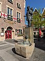
File:F2_E-SRFR,_Interboot_2020,_Friedrichshafen_(IB200073).jpg
[edit].jpg)
- Nomination Demonstration of the F2 E-SRFR electric inflatable board at at Interboot 2020 --MB-one 13:53, 28 September 2020 (UTC)
- Promotion
- Oppose I am sorry but the composition does not work for me. The person in front is placed directely in front of that fountain. --Augustgeyler 14:22, 28 September 2020 (UTC)
- Support That makes the composition fun. Good quality. -- Ikan Kekek 06:12, 29 September 2020 (UTC)
- Comment To achieve this, the fountain should have been placed fully behind the persons head. --Augustgeyler 20:06, 30 September 2020 (UTC)
- Comment This is Quality Image Candidates, not Perfect Image Candidates. -- Ikan Kekek 05:00, 1 October 2020 (UTC)
- Support per Ikan --Trougnouf 20:58, 2 October 2020 (UTC)
- Support QI for me --Jakubhal 05:32, 30 September 2020 (UTC)
- Support per Ikan. --Smial 10:14, 30 September 2020 (UTC)
- Oppose I find this picture far from a QI, sorry, you all know I do not oppose often. But to me the composition does not work at all - what is this image supposed to show? And why is the crop at the bottom so tight? If the fountain is supposed to be an interesting part - why do we not see more of it? --Kritzolina 16:58, 1 October 2020 (UTC)
- Oppose Sorry, I have to agree with Augustgeyler and Kritzolina the composition of the fountain directly behind the head is very distracting. Of all the places it could be, it's not there. Maybe it doesn't have to be a 'perfect image' to be QI but I have seen candidates declined on composition before... I think this is one of them, unfortunately. Not a QI for me. Crep171166 09:01, 3 October 2020 (UTC)
Total: 4 support (excluding the nominator), 3 oppose →  Promoted --Peulle 11:04, 5 October 2020 (UTC)